How to read this walk-through. The main points are in the sections “The method in one line” (the signal and the test) and “Signal saturation”: this is the most practical part of the paper. Section 4 on how the two hundred years of data were assembled is useful in its own right if you work with long historical series. The formulas are taken apart symbol by symbol and on numbers; the numbers in the examples are either from the paper or marked as ours. We did not recompute the paper's own numbers.
The main thesis
The paper answers the question of whether trend exists as an anomaly, and it does so with a statistical test rather than by building an investment product. The authors take a simple trend signal with a horizon of about five months and test it on 27 markets in four asset classes: first on futures since 1960, then on spot series, which make it possible to go back to 1800 for equity indices and commodities.
The result: the t-statistic of the excess return is about 5 since 1960 and about 10 since 1800 after accounting for the general rise of markets. The effect is stable over time and across asset classes. The authors draw a strong conclusion: this is "one of the most statistically significant anomalies in financial markets".
Two more results. The link between signal strength and the price move in the following month is not linear but saturates: a strong trend does not predict proportionally more than a moderate one. And the weak result of trend-following funds in 2011–2014, by the authors' estimate, fits within an ordinary statistical fluctuation for a strategy with such a Sharpe ratio; short trends on the order of three days, however, really have weakened, and the authors cannot explain it.
The authors' position is more cautious than the title. On “the end of trends” they write: "Although we cannot exclude that this recent period is a precursor of the" end of trends, "we argue theoretically that this is an unlikely scenario".
1. How this test differs from portfolio papers
The papers by Moskowitz, Ooi, Pedersen (2012) and Hurst, Ooi, Pedersen (2017) build a portfolio close to what an investor could hold, and the second one also includes costs and fees. The task here is different: to show that the effect exists and to measure its significance. Costs are not modeled: "We call this a fictitious P&L since no attempt is made to model any realistic implementation costs of the strategy".
The set of markets is deliberately narrow: only instruments with a long history. For indices, bonds and currencies these are seven countries: Australia, Canada, Germany, Japan, Switzerland, the United Kingdom and the United States. Commodities: oil, Henry Hub natural gas, corn, wheat, sugar, live cattle and copper. In total, 7 commodities, 7 ten-year bonds, 7 equity indices and 6 currencies, all data from Global Financial Data. The authors note: "We believe the results of this section would only be improved by the choice of a wider pool".
For the scale of the phenomenon the authors give industry figures: as of the 4th quarter of 2013, trend-following funds (CTAs) managed at least 325 billion dollars, about 16 % of the assets of the whole hedge fund industry, and accounted for a few percent of daily turnover in futures markets.
2. The method in one line
Each month: how far the last price has moved from its exponential average over months, in units of the typical monthly move; the sign of this number determines a long or a short of size ; the significance of the effect is the t-statistic of the cumulative result.
What this is. The strength of the trend as a single number: how far the price has moved from its recent average, measured in units of the usual monthly move (equation 1 of the paper).
What each symbol means.
- : last month's closing price. Last month is used, not the current one: the signal is known at the start of month , before the result for that month is counted.
- : angle brackets denote an average. Here it is the exponential moving average of past prices with a decay time of months, without the current price.
- : the memory horizon in months. The main variant in the paper is .
- (“sigma”): the exponential average of absolute monthly price changes with the same , that is, the typical size of a move regardless of sign.
Step by step, our example. Last month's price is 120, the moving average is 100, the typical monthly move is 10. Then : the price has moved up by two usual moves, the trend is strong. At a price of 103 it would be , a weak trend.
Why divide by . So that the number is dimensionless and comparable across markets. A 5-dollar gap in oil and in a bond are different events, while “moved by two of its usual moves” means the same thing everywhere.
What this is. The cumulative result of the strategy on one instrument (equation 2 of the paper). Depending on the sign of the signal, the strategy buys or sells a quantity of contracts, that is, it holds constant risk.
What each symbol means.
- : the cumulative “fictitious” result; here is simply the instrument number, not alpha.
- : the sum over all past months; is read “t prime”.
- : only the sign of the signal, or . The size of the signal is deliberately not used; it is studied separately (section 6).
- : the price change over a month in units of the typical move. The result is measured not in money but in “how many usual moves were captured”.
How this relates to other papers. Dividing the result by is equivalent to a position inversely proportional to volatility, as in Moskowitz, Ooi and Pedersen: there the position size is divided, here the result is, and the outcome is the same.
The authors define the Sharpe ratio as the mean return divided by volatility, both annualized. The risk-free rate is not subtracted: the P&L does not include interest on capital, and futures are self-financing. Hence the t-statistic:
What this is. How confidently the mean result differs from zero. A value of about 2 and above is usually considered significant.
What each symbol means. : the annual Sharpe ratio; : the number of years the strategy has run; : the square root.
What it says. Confidence grows not in proportion to the length of history but as its square root. To double the confidence you need four times as much data.
Our examples. A Sharpe of 0.7 over 5 years: , not significant. The same over 10 years: , borderline. Over two centuries: , hence the order of “about 10” in this paper. A Sharpe of 2.0 over 3 years: , significant, but only if it was the only hypothesis tested and not the best of a hundred tried.
Why this matters. A nice Sharpe on a short history proves little. This product is worth working out in your head before celebrating a backtest.
Correction for the general rise of markets. Most markets have risen over their history, and a strategy that is often long would have earned from this without any prediction. So the authors also compute a “cleaned” (de-biased) version: the residual of the trend result after removing its beta to the “always long” strategy. The authors define the drift of a series as the instrument's mean daily return, that is, the result of the “always long” strategy without the cost of financing. The correction turned out to be small, because the trend result and “always long” are only weakly related, with a correlation of "+15 % correlated": the t-statistic on futures falls from 5.9 to 5.0.
3. Futures since 1960
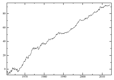
How to read it. The cumulative result from equation 2, summed over all instruments. The vertical units are arbitrary (moves in units of volatility); what matters is the shape of the line. The paper's caption: t-statistic 5.9 (Sharpe 0.8), 5.0 after removing the long.
What to notice. The line rises fairly evenly, with no single period that delivers the whole result. In the first years, when the sample is almost entirely commodities, it hovers around zero.
Dependence on the horizon (table 1 of the paper):
| , months | Sharpe | t-stat | de-biased t-stat |
|---|---|---|---|
| 2 | 0.80 | 5.9 | 5.5 |
| 3 | 0.83 | 6.1 | 5.5 |
| 5 | 0.78 | 5.7 | 5.0 |
| 7 | 0.80 | 5.9 | 5.0 |
| 10 | 0.76 | 5.6 | 5.1 |
| 15 | 0.65 | 4.8 | 4.5 |
| 20 | 0.57 | 4.2 | 3.3 |
How to read it. A plateau from 2 to 10 months, a decline after 15. The result does not rest on one lucky value of the horizon: this is a sign of an effect, not of overfitting. In their 2012 paper Moskowitz, Ooi and Pedersen reached a similar conclusion with their own parameter grid on other data.
By sector (table 2, ):
| Sector | Trend Sharpe | t-stat | de-biased t-stat | Drift Sharpe | Drift t-stat | Start |
|---|---|---|---|---|---|---|
| Currencies | 0.57 | 3.6 | 3.4 | 0.05 | 0.32 | 05/1973 |
| Commodities | 0.80 | 5.9 | 5.0 | 0.33 | 2.45 | 01/1960 |
| Bonds | 0.49 | 2.8 | 1.6 | 0.58 | 3.3 | 05/1982 |
| Indices | 0.41 | 2.3 | 2.1 | 0.40 | 2.3 | 01/1982 |
What drift is. The mean return of the instrument itself, that is, the result of “buy and hold”. The column is there for comparison: did the trend earn anything beyond simple holding.
The “Bonds” row. After removing the long the t-statistic falls from 2.8 to 1.6, while the drift itself has 3.3. In the futures sample since 1982 a noticeable part of the trend result on bonds is explained by their general rise. In the two-century sample the picture for bonds is different (section 5).
By decade (table 3):
| Period | Trend Sharpe | t-stat | de-biased t-stat | Drift Sharpe |
|---|---|---|---|---|
| 1960–1970 | 0.66 | 2.1 | 1.8 | 0.17 |
| 1970–1980 | 1.15 | 3.64 | 2.5 | 0.78 |
| 1980–1990 | 1.05 | 3.3 | 2.85 | −0.03 |
| 1990–2000 | 1.12 | 3.5 | 3.03 | 0.79 |
| after 2000 | 0.75 | 2.8 | 1.9 | 0.68 |
The authors sum up: the trend t-statistic is at least 2.1 in all sectors and decades, and at least 1.6 after cleaning. But the futures history is only about 50 years long, and the first 10 of them are almost entirely commodities. So it needs to be extended.
4. How the two hundred years were assembled
The key selection rule: a trend can develop only on a freely traded instrument whose price is not distorted by the state, and on one liquid enough for prices to be meaningful. This rule cuts the history differently for different asset classes. The proxies for futures are spot prices of currencies, equity indices and commodities, and for bonds, as the paper puts it, "government rates for bonds".
Currencies: only from 1973. In 1944–1971 the Bretton Woods system was in force: exchange rates were pegged to the dollar within a 1 % band, and there can be no trend in a narrow band around a reference value. Before it there was the gold standard, with the same effect. In the 1930s many countries left it with massive devaluations, but this produced managed exchange rates, not free trends. The authors find no freely floating substitute for futures before 1973.
Bonds: from 1918. A trend in rates needs a liquid secondary market where debt can be sold at any moment. For most of history governments borrowed for extraordinary expenses, above all wars, and then the debt was repaid or diluted by economic growth.
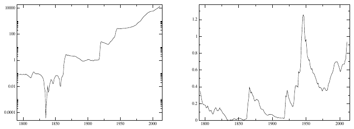
How to read it. Left panel: US debt in billions of dollars, log scale (each tick is 100 times the previous one). Right: debt as a share of GDP, ordinary scale.
What to notice. The debt from the War of Independence practically disappears by 1835–1836; on the left panel this is a deep dip. The spike of 1860–1865 (the Civil War) is then diluted by growth. Only from the First World War does the debt stop being repaid and from then on roll over from issue to issue.
Why this figure is in a paper about trend. It justifies the start date: as long as the debt keeps appearing and disappearing, there is no permanent liquid bond market.
The second justification: at the start of the 20th century the right to print money passes to central banks (table 4 of the paper: Switzerland 1907, Japan 1904, Australia 1911, the US 1913, Germany 1914, Canada 1935, the UK as early as 1844), and this raises confidence in government debt. According to the authors, apart from Australia with its steady growth of debt and Japan with a break around 1905 (the war with Russia), the other countries show the same picture as the US. The war years and the immediate postwar years in Japan and Germany are excluded as a period of managed economy.
Indices and commodities: from the 18th–19th centuries. Equities and commodities were actively traded throughout the 19th century. Indices: the UK from 1693, the US from 1791, Germany from 1870, Australia from 1875, Canada, Switzerland and Japan from 1914. Commodities: sugar from 1784, copper from 1800, wheat from 1841, corn and live cattle from 1858, oil from 1859, natural gas from 1986. Exchange closures (the Second World War in Germany and Japan) and the period of a fixed oil price in the second half of the 20th century are excluded.
Checking the proxies. Before going back in time, the authors compare the trend on spot series and on futures over the common period.
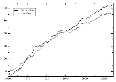
How to read it. Black line: the trend on futures; grey: on spot prices; the common period from 1960.
What to notice. From the late 1960s, when there are enough futures, the lines run close together. Over time the spot one lags slightly: the paper's caption says that the slope on spot is a little smaller,
"as expected".
Since 1982, when futures exist in all four sectors, the correlation of the two versions is 91 %. By sector since 1960 (table 7): indices 0.92, bonds 0.91, commodities 0.65. The authors explain the low correlation for commodities by the cost of storage and financing (cost of carry), which is absent from spot data and which for commodities is especially large and variable. The authors' conclusion: "In any case the addition of the cost of carry can only improve the performance of the trend on futures", and the conclusions on spot, in their words, will only be confirmed by futures. Why adding carry can only improve the result is not shown in the paper (section 9).
5. Two centuries
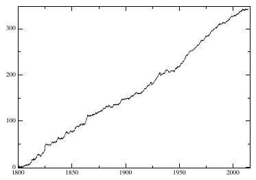
How to read it. The same calculation on two hundred years of history. The paper's caption: t-statistic 10.5, 9.8 after removing the long, Sharpe 0.72.
What to compare it with. The t-statistic of the drift itself, that is, of “buy and hold everything”, on the same series is 4.6. Over two centuries the trend is statistically more visible than the general rise of markets.
Why the line is steeper in the second half. According to the authors, probably because the number of instruments grows: bonds enter from 1918, currencies from 1973. Diversification grows; the trends themselves are not necessarily stronger.
By sector over the whole history (table 8):
| Sector | Trend Sharpe | t-stat | de-biased t-stat | Drift Sharpe | Drift t-stat | Start |
|---|---|---|---|---|---|---|
| Currencies | 0.47 | 2.9 | 2.9 | 0.10 | 0.63 | 1973 |
| Commodities | 0.28 | 4.1 | 3.1 | 0.30 | 4.5 | 1800 |
| Bonds | 0.40 | 3.9 | 2.7 | −0.10 | −1.0 | 1918 |
| Indices | 0.70 | 10.2 | 6.3 | 0.40 | 5.7 | 1800 |
How to read it. Each sector is significant on its own: the trend t-statistic is at least 2.9, and at least 2.7 after cleaning. The de-biased trend t-statistic is higher than the “always long” t-statistic everywhere except commodities (3.1 against 4.5).
The “Bonds” row. The drift of the bond series since 1918 is negative (Sharpe −0.10, t = −1.0), while the trend on it gives a Sharpe of 0.40 with t = 3.9. Trend works even where the series has no positive drift. A caveat: for bonds the proxy is a series of government rates, and the paper does not explain in detail how exactly the drift of such a series is defined.
By half-century (table 9):
| Period | Trend Sharpe | t-stat | Drift Sharpe | Drift t-stat |
|---|---|---|---|---|
| 1800–1850 | 0.60 | 4.2 | 0.06 | 0.4 |
| 1850–1900 | 0.57 | 3.7 | 0.43 | 3.0 |
| 1900–1950 | 0.81 | 5.7 | 0.34 | 2.4 |
| after 1950 | 0.99 | 7.9 | 0.41 | 2.9 |
In 1800–1850 the drift is almost zero (Sharpe 0.06), while the trend gives 0.60. The authors write that the result is positive in every decade of the sample.
6. Signal saturation
Instead of the cumulative result the authors look at a scatter of points: horizontally the signal strength , vertically the price move in the following month . By eye the cloud is shapeless; in the authors' words, "very little structure". But a straight line through it has a significant slope:
What these numbers mean.
- : where the line crosses the vertical axis, that is, the mean move at a zero signal. means that the “always long” strategy is profitable on average: this is the general rise of markets.
- : the slope. means that the stronger the trend, the larger the move in the following month. This is the effect.
- “”: the error of the estimate. 0.018 with an error of 0.003 is six errors; the estimate is reliable.
- (“xi”): noise, everything left unexplained.
But a linear relationship need not be the right one. A cubic regression gives a very small coefficient on and a clearly negative one on : strong signals flatten out. However, a negative cubic term would predict a strong reversal at very large , and the authors call such a conclusion suspicious ("is suspicious"). Instead they model the saturation with a hyperbolic tangent:
What (“hyperbolic tangent”) is. A function that squeezes any number into the interval from −1 to +1. It barely changes small values: , . It compresses medium ones: . It flattens large ones: , . On a chart this is the letter S: almost straight in the middle, plateaus at the edges.
What means. The scale of the inflection. The signal is divided by , so it is this number that sets the boundary between a “weak” and a “strong” trend. When is much smaller than the formula behaves like a linear one; when is larger than saturation kicks in. As it becomes a straight line again.
The fit result. , . The inflection is roughly where the price has moved nine tenths of a usual monthly move away from the average. Beyond that, the next month's move on average barely grows. According to the authors, this model is better than both the cubic and the linear one, and the values of , and barely change for from 2.5 to 10 months.
Step by step, our example with the paper's coefficients. Signal . The line: . The tangent: , , , together with about 0.083. Signal : the line gives 0.037, the tangent about 0.052. The tangent model has a steeper slope in the middle ( against 0.038), so it rates weak and medium signals higher than the line does, and strong ones lower. The value of for the tangent model is not given separately in the paper; we took the same 0.018.
Why this matters. If the relationship saturates, there is no point in increasing the position in proportion to signal strength without a cap: the strongest signals do not give a proportionally larger move.
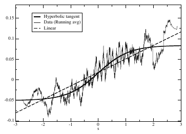
How to read it. Horizontally the signal strength from −3 to 3, vertically the price move in the following month. The thin jagged line: the data, a moving average over 5,000 neighboring points out of 240,000. The thick S-shaped one: the tangent fit. Dashed: the straight line. An important detail from the caption: the fit was made
"for futures data only", that is, on futures, not on the two-century spot series.What to notice. In the middle, for up to 1, the three lines run together. Between 1 and 2 the data lie below the straight line and closer to the tangent. Left of −2 the data are also closer to the tangent's plateau. On the right, for above 2, where there are few points, the moving average rises again to 0.14, above both curves. At the curve passes slightly above zero: this is , the general rise of markets.
The practical takeaway. Saturation is visible in the range from 1 to 2, where there is plenty of data. At the most extreme values there is little data, and the shape there is poorly determined.
The authors' explanation: fundamentalists do not resist weak trends, but when the price moves noticeably they start to consider it wrong and step in against it. In the conclusions this is phrased cautiously: they "might step in when their own signal becomes strong enough". There is no detailed behavioral model of saturation in the paper; the authors call building one an interesting problem.
7. On “the end of trends”
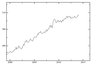
How to read it. The same cumulative result, only from 2000. The paper's caption: since 2011 the strategy has been practically flat.
What to notice. A rise until 2008 with a jump in 2008 and then an almost horizontal stretch. It is this plateau that managers and investors in trend-following funds were discussing when the paper was written.
The authors' answer has two parts. The first is statistical: for a strategy with a historical Sharpe below 0.8, long drawdowns should come as no surprise.
What this is. The typical duration of a drawdown, in years, for a strategy with an annual Sharpe of . The authors present it as a known result with references to other papers; there is no derivation in the text.
Step by step. Square the Sharpe ratio, divide one by the result.
The paper's example. A Sharpe of 0.7: years of typical drawdown, and
"drawdowns of 4 years are not exceptional".Our examples. A Sharpe of 1.0: about a year. A Sharpe of 1.5: about 5 months. A Sharpe of 2.0: about 3 months.
Why this matters. This is a criterion that can be applied in advance. A half-year drawdown for a strategy with a Sharpe of 1.0 is within the norm; a two-year one for a strategy with a claimed Sharpe of 2.0 means that something is wrong with the strategy or with the Sharpe estimate.
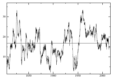
How to read it. At each point, the strategy's result over the previous 10 years; the horizontal line is the historical average, about 17 in arbitrary units.
What to notice. The curve swings widely and has dropped below the average many times, deeper than in 2014; the deepest dips are around 1900 and in the 1940s. The authors write:
"A much worse performance was in fact observed in the 1940s". And most importantly: over two centuries the 10-year result has"never been negative in two centuries".The practical takeaway. It is more useful to judge a trend strategy by its result over a window of several typical drawdowns than by its current drawdown.
The second part is substantive: the crowding hypothesis, “too much money in one idea”. According to the authors, it "is not borne out by our analysis", and this is consistent with their estimate that CTAs account for only a few percent of turnover. Besides, the authors point to a logical difficulty: if trends are generated by extrapolative expectations, an influx of new trend followers should rather accelerate trends, because managers try to get ahead of their competitors, not destroy them.
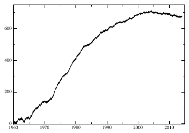
How to read it. The same as figure 1, but with a horizon of about three days instead of five months. The caption says “since 1970”; the figure's axis starts in 1960.
What to notice. A confident rise until the early 2000s, then a plateau and a slight decline. In the text: short trends
"significantly decayed since 1990"; in the caption:"The effect seems to have completely disappeared since 2003 (or has maybe even inverted)".Why this matters. The authors call this a puzzle: fast trends gradually disappeared and never strengthened during that time.
"Coming up with a plausible mechanism that explains how these fast trends have disappeared would be highly valuable". Hurst, Ooi and Pedersen have a similar observation on a different sample: in 2010–2016 the one-month signal there gave a Sharpe of 0.06 before costs, and the 12-month one 0.73.
8. Where trend comes from: two versions
Under-reaction to news. Information enters the price gradually. The authors' example: a series of rate hikes announced several months ahead is not reflected in bond prices at once, because participants believe what they see and change their expectations slowly (“conservatism”). If policy changes were correctly anticipated, the price would jump to the end point at once; if not, it follows along, and this inertia produces a trend.
Extrapolative expectations. Past returns directly shape expectations: it rose, so it will keep rising. The authors refer to experiments with artificial markets, to surveys and to agent-based models in which an imbalance between trend followers and fundamentalists is needed to reproduce fat tails and volatility clustering. In footnote 6 they add, "Anecdotally", their own experience: judging by the long history of inflows and outflows in CFM's funds, professional investors tend to chase performance, investing after a rise and withdrawing money after a fall.
Why the difference is practical. If trend is generated by under-reaction, it may disappear once participants learn to anticipate policy changes. If by extrapolative expectations, the effect is self-sustaining. The authors lean toward the second: the evidence for it seems to them
"strong enough to advocate extrapolative expectations over under-reactions". At the same time they note that trends existed long before the growth of CTA assets and that, judging by the data, CTAs have made long-term trends neither noticeably stronger nor noticeably weaker.
9. What is shaky in the paper
The authors' own caveats
Costs. The P&L is called fictitious: realistic execution costs are not modeled.
A narrow set. 27 instruments from seven developed countries; the authors believe a wider set would only improve the result.
Spot instead of futures. For commodities the correlation of the trend strategy on spot and on futures is 0.65. The authors acknowledge that the cost of carry for commodities is especially large and variable, but consider the level of correlation sufficient.
The end of trends is not ruled out. The authors write plainly that they cannot rule out that the latest period heralds the end of trends, although they consider it unlikely.
Fast trends are not explained. The authors have no mechanism for the disappearance of the three-day trend.
Crowding. The degradation of recent years "might be attributed" to crowding, but the authors do not see how this would work under extrapolative expectations.
What is visible on reading but not discussed in the paper
“Carry can only improve.” The claim that accounting for the cost of carry on futures can only improve the trend result is given without proof. The cost of carrying a position in commodities can work both for and against the position, and for a trend strategy with longs and shorts its sign is not obvious in advance. Our conclusion, not the authors'.
Risk premium. The claim that the excess return of trend cannot be attributed to any risk premium is made with a reference to a review of momentum and to the authors' own paper, which at the time the preprint came out was “in preparation”. It is not tested in this paper. In the same place, in footnote 4, it is said that trend is correlated with “long-vol” strategies.
Saturation is measured on futures only. The caption of figure 5 says plainly that the 240,000 points are futures data. The two-century part does not enter the estimate of . And at the extreme values of the signal the moving average of the data goes above both the tangent and the straight line, so the shape of saturation is clearly visible in the middle range, not at the edges.
Bonds and rates. For bonds the proxy is a series of rates, and table 8 gives them a “drift” with a negative Sharpe. What the drift of a rate means in terms of a bondholder's return is not worked out in the paper, and the direct conclusion “holding bonds since 1918 was a losing proposition” cannot be drawn from this row.
No correction for multiple testing. The horizon was chosen as the main one after the authors had looked at the results for from 2 to 20; the plateau in table 1 is wide, so the choice hardly matters, but there is no correction for the number of trials.
10. What follows in practice
Compute significance from the length of history. The t-statistic of about 10 came out at a Sharpe of 0.72 because the history is two hundred years long. A 10-year backtest with a Sharpe of 1.0 gives about 3.2, with a Sharpe of 0.7 about 2.2 (our calculation from the formula ), and that is with one hypothesis tested, not a hundred tried.
Calibrate drawdown expectations with the rule. This is a quick reference point: at a Sharpe of 1.0 a half-year drawdown is normal, at a Sharpe of 0.7 so is a two-year one.
Signal saturation can be measured on your own data. The authors have in units of “deviation from the exponential average divided by the mean absolute monthly change”. This number belongs to their definition of the signal and to their markets; on other markets and with other normalization it has to be measured anew.
Short trends need more evidence than long ones. Two independent papers on different data see the fading of fast trend in the 2000s and 2010s.
Test trend on markets without growth too. The paper shows trend on series with zero and negative drift. If a trend strategy earns only where the underlying asset rose, that is a reason to check whether it is a hidden long.
Select long historical series by the rule “freely traded and liquid”. Currencies under a fixed exchange rate, prices under state control and closed exchanges should not enter the sample silently. The technique is useful not only for trend.
11. Testable ideas
| No. | Idea | Type | Where to compute |
|---|---|---|---|
| 1 | Build the “signal strength versus next month's move” cloud for your instruments, average by bins and fit the linear, cubic and tangent models; get your own and use it as the scale for capping the position | design change | Python |
| 2 | Check whether your is stable when the horizon changes from 2.5 to 10 months; a strongly drifting value means overfitting, not a property of the market | diagnostic | Python |
| 3 | For any trend result, compute the cleaned version: the residual after regression on “always long” with the same position sizes, and report both t-statistics | acceptance metric | Python |
| 4 | From the claimed Sharpe, compute the expected duration of a typical drawdown and compare with the actual one; the signal to reconsider is exceeding 2–3 such periods, not the drawdown itself | acceptance metric | any |
| 5 | Build four trend series on your data with horizons of 3 days, 1, 5 and 12 months and watch the rolling 10-year return of each | diagnostic | Python |
| 6 | Track the rolling return of the trend strategy over a window of several typical drawdowns as an indicator of the effect's health, instead of the current drawdown | acceptance metric | Python |
| 7 | Check historical series for periods of fixed exchange rates, price bands and trading halts, and exclude them explicitly | audit | any |
| 8 | Separate the test of whether the effect exists (P&L by the sign of the signal) from the test of position scaling (by the size of the signal), as in the paper | design change | Python |
| 9 | Select markets with zero or negative “buy and hold” drift and test the trend strategy on them separately | diagnostic | Python |