How to read this walk-through. The main conclusion and the whole construction of the strategy are in the section “The method in one line”: one formula for the signal and one formula for position size. Sections 4–8 show what the conclusion rests on; they can be read in any order. Section 10 on hedgers and speculators is the most contested in interpretation. We did not recompute the numbers: all of them are taken from the paper's tables and text, and our examples are marked.
The main thesis
The authors call it an anomaly, “time-series momentum” (TSMOM): an instrument's return over the last 12 months in excess of the risk-free rate positively predicts its return in the next month. The effect lasts about a year and then partially reverses over a horizon of two to five years. The test uses 58 liquid futures and forwards: equity indices, currencies, commodities and government bonds, more than 25 years of data.
Three conclusions go beyond the fact itself. First: time-series momentum is related to classic cross-sectional momentum but does not coincide with it, although both strategies feed mostly on the same autocovariance. Second: the strategy earns the most in quarters of the strongest equity market moves, up and down, so its premium, in the authors' words, is "not likely to be compensation for crash risk". Third: according to weekly CFTC positions, speculators hold positions along the trend and apparently profit at the expense of hedgers.
The authors are cautious with the explanation. The pattern “momentum, then partial reversal” "may be consistent" with theories of initial underreaction and delayed overreaction, but the introduction says directly: "we cannot rule out the existence of a rational theory that can explain these findings".
1. How time-series momentum differs from cross-sectional momentum
Classic momentum compares stocks with each other: buy those that rose more than the rest over the year, sell the laggards. This is the cross-section, a view across the market at a single point in time. Such a portfolio always has both longs and shorts: someone always lags behind.
Time-series momentum looks at each instrument separately. Oil rose over the year in excess of the risk-free rate, so go long oil, whatever gold and the yen are doing. This is a view along the history of a single instrument. The portfolio may end up long everything at once or short everything at once.
The authors stress one more difference from the older literature on return autocorrelation. There the window used to look at the past is usually equal to the horizon being predicted. When the two periods are separated, a predictability appears that annual autocorrelation misses: the past 12 months strongly predict the next one month.
2. The method in one line
Every month, for each instrument: if the return over the past 12 months in excess of the risk-free rate is positive, go long; if negative, go short; the position is sized so that its annual volatility is 40 %; the portfolio is the equal-weighted average across all instruments.
What this is. The first line: what the strategy does with one instrument in one month (equation 5 of the paper). The second: how everything adds up into a portfolio.
What each symbol means.
- (“s”): the instrument index, a superscript, not a power.
- : the instrument's excess return over the last 12 months. This is the signal.
- (“sign”): for a positive number, for a negative one. The size of the move does not matter, only the direction.
- (“sigma”): the instrument's forecast annual volatility (formula below).
- : position size. The numerator is how much risk we want per position, the denominator how much risk the instrument carries.
- : the instrument's return in the next month. The only thing unknown at the moment of the decision.
- : how many instruments are available in month ; is an ordinary average.
Step by step, our example. Oil rose 25 % over 12 months: sign . Oil's forecast volatility is 30 %: size . In the next month oil rose 4 %. Contribution: . Had oil fallen over the year, the sign would be and the same 4 % rise would give a loss of 5.3 %.
Why 40 %. The authors write:
"The choice of 40% is inconsequential". Multiplying all positions by one constant changes return and volatility in the same proportion; the Sharpe ratio does not change. 40 % was chosen because it is roughly the risk of an individual stock, and after averaging across all instruments the portfolio gets about 12 % annual volatility over 1985–2009, like the familiar academic factors. Footnote 8 adds that this construction requires"margin capital of about 5–20%", that is, it is implementable.
Forecast volatility is computed from daily returns with exponential weights:
What this is. How strongly the instrument is jumping around now, with recent days weighing more than old ones (equation 1 of the paper).
What each symbol means.
- : the variance at time ; volatility is its square root.
- : the number of trading days in a year; converts a daily quantity into an annual one.
- : a sum over all past days; is yesterday, the day before yesterday.
- : the daily return days ago; (“r bar”): the average return computed with the same decaying weights.
- (“delta”): the forgetting factor, slightly below one; is the weight of day , and the weights sum to one.
How is chosen. From the condition that the center of mass of the weights falls at 60 days: , hence . In terms of inertia the estimate is close to a plain average over roughly three months.
How the weights work, our example. With the weight of yesterday is 0.02, of the day before yesterday 0.0196, of a day a month ago () about 0.013, of a day a year ago () about 0.0001. There is memory, but it fades.
Why this matters. The authors make three caveats that matter more than the formula itself. The model is the same for all assets at all times; there is no fitting to the instrument. It was chosen
"due to its simplicity and lack of look-ahead bias", and the results, according to the authors, are robust to more sophisticated volatility models. And most importantly: throughout the paper the return of month is paired with the volatility estimate from time , so that no information from the future enters the position size.
3. Data
The sample: 24 commodity futures, 12 cross-currency pairs from nine currencies, 9 developed-market equity indices and 13 government bond futures, from January 1965 to December 2009. Instruments were selected for liquidity, so that illiquidity and stale prices do not affect the result. Footnote 4 says that the result also holds on illiquid instruments (feeder cattle, Kansas wheat, lumber, orange juice, rubber, tin, emerging-market currencies and equities), but those numbers are not reported. The main results are computed from 1985, when there are already many instruments and the markets are liquid; with data from 1965, according to the authors, the results are similar and usually more significant.
The return series for each instrument is built like this: each day the excess return of the most liquid contract is taken (usually the nearest one or the next after it), and the daily returns are compounded into a cumulative index. As a robustness check the “far” contract, the one following the most liquid, is used: for commodities momentum on it is even slightly stronger, for financial futures it barely changes. Bond futures returns are scaled to constant duration (2 years for 2- and 3-year bonds, 4 for 5-year, 7 for 10-year, 20 for 30-year). Before futures existed, cash indices are used: MSCI country indices for equities, JP Morgan indices for bonds.
Table 1 of the paper shows two things. Mean returns are far from all positive: corn has −3.19 % a year, natural gas −9.74 %, wheat −1.84 %, the Swedish krona −0.05 %. Significantly positive means exist only for equity and bond futures. And the spread of volatility is huge: natural gas 53.30 % a year, German two-year bonds 1.53 %, US two-year bonds 1.86 %. That is why positions have to be scaled to volatility: positions equal in money would hand the portfolio over to natural gas.
4. Predictability without any strategy
First the authors test the fact itself that the past predicts the future, with two regressions pooled across all instruments and months:
What this is. The relationship between this month's return and the return months ago (equations 2 and 3 of the paper). The regression fits a line to the cloud of points “what happened then, what happens now” and says how confidently the slope differs from zero.
What each symbol means.
- : the lag in months, from 1 to 60.
- (“beta”): the strength of the relationship for a given lag. The key quantity.
- (“alpha”): the intercept, of no interest here.
- (“epsilon”): everything the relationship does not explain.
- Division by : bringing everything to a common scale. Without it natural gas would dominate the statistics and two-year bonds would be invisible. The authors compare this to generalized least squares and write in footnote 7 that without this adjustment the results are qualitatively the same.
How the two lines differ. In the first the predictor is the size of the past return, in the second only its sign. The second is cruder, but it is the one that corresponds to the trading rule.
On the errors. Standard errors are clustered by month. All 58 contracts partly move together in any given month, and without this adjustment the statistics would treat them as 58 independent observations, and confidence would be overstated.
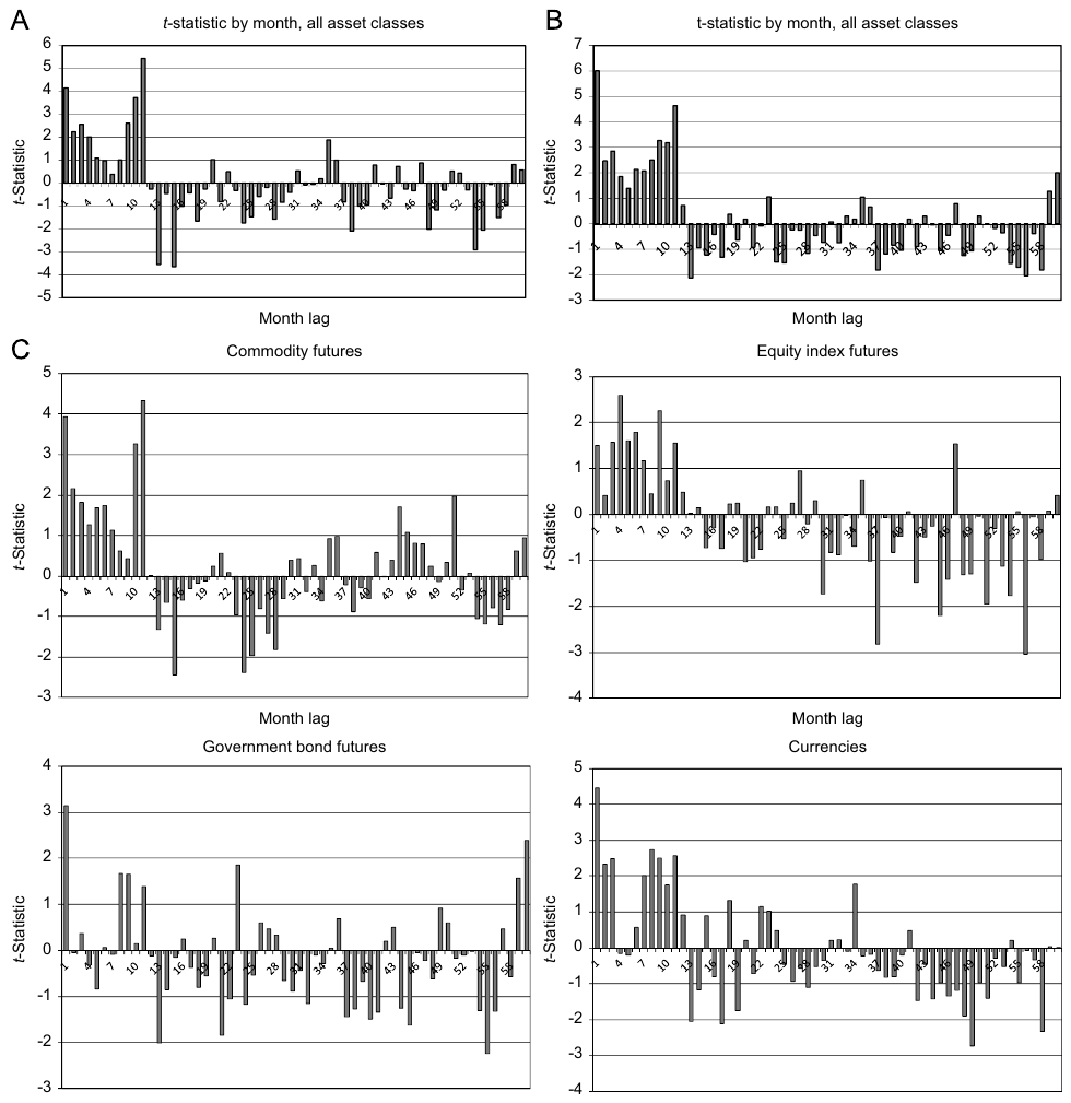
How to read it. The horizontal axis is the lag in months, the vertical one the t-statistic. Values above 2 in absolute terms are conventionally considered significant. Panel A: the predictor is the size of the past return; panel B: only its sign; panel C: the sign regression separately for commodities, equity indices, bonds and currencies. Sample January 1985 – December 2009.
What to notice. In panel B all of the first 12 bars are positive, nine of them significant (the text says so). After that most bars are negative: what rose two to three years ago more often fell afterward. By asset class the shape is the same, although for bonds and currencies the first months look more uneven.
The practical takeaway. The same shape in four different asset classes, traded by different people for different reasons. This is stronger than any single number.
5. The grid of look-back and holding periods
Next, strategies are built: a signal window (how many months of past return we look at) and a holding period (how many months we hold), from 1 to 48 months each. To avoid overlapping observations when holding for longer than a month, the month's return is computed as the average across all portfolios still held in that month. This is the Jegadeesh–Titman method: one series of monthly returns for each pair , with no double counting of the same money.
Each strategy's alpha is computed by regression on the equity market (MSCI World), bonds (Barclays Aggregate), commodities (S&P GSCI), on two Fama–French factors, size (SMB) and value (HML), and on the cross-sectional momentum factor (UMD, Carhart). Below are the t-statistics of the alphas for all assets, panel A of Table 2.
| Look-back \ holding, months | 1 | 3 | 6 | 9 | 12 | 24 | 36 | 48 |
|---|---|---|---|---|---|---|---|---|
| 1 | 4.34 | 4.68 | 3.83 | 4.29 | 5.12 | 3.02 | 2.74 | 1.90 |
| 3 | 5.35 | 4.42 | 3.54 | 4.73 | 4.50 | 2.60 | 1.97 | 1.52 |
| 6 | 5.03 | 4.54 | 4.93 | 5.32 | 4.43 | 2.79 | 1.89 | 1.42 |
| 9 | 6.06 | 6.13 | 5.78 | 5.07 | 4.10 | 2.57 | 1.45 | 1.19 |
| 12 | 6.61 | 5.60 | 4.44 | 3.69 | 2.85 | 1.68 | 0.66 | 0.46 |
| 24 | 3.95 | 3.19 | 2.44 | 1.95 | 1.50 | 0.20 | −0.09 | −0.33 |
| 36 | 2.70 | 2.20 | 1.44 | 0.96 | 0.62 | 0.28 | 0.07 | 0.20 |
| 48 | 1.84 | 1.55 | 1.16 | 1.00 | 0.86 | 0.38 | 0.46 | 0.74 |
What alpha is. The part of return that remains after subtracting everything that could have been earned simply by holding the equity, bond and commodity markets and the three well-known equity factors. The table shows not the alphas themselves but their t-statistics: the confidence that alpha differs from zero. The significance threshold is about 2.
How to read the table. Rows are the signal window, columns the holding period. Significance covers almost the entire upper left corner, where both periods are no longer than 12 months. The authors say exactly that: the effect is robust across horizons and asset classes,
"particularly when the look-back and holding periods are 12 months or less".Why this is worth more than one big number. If the result rested on one cell and fell apart in its neighbors, it would look like overfitting: out of 64 variants one fired by chance. Here significance is spread across dozens of neighboring combinations.
Panels B–E of Table 2 give the same grid by asset class. For currencies, for example, with a window of 24–48 months and long holding the alpha t-statistics are already negative, that is, the reversal there is more pronounced. For further analysis the authors take one strategy: a 12-month window and 1-month holding, and that is what they call TSMOM.
6. The diversified TSMOM factor
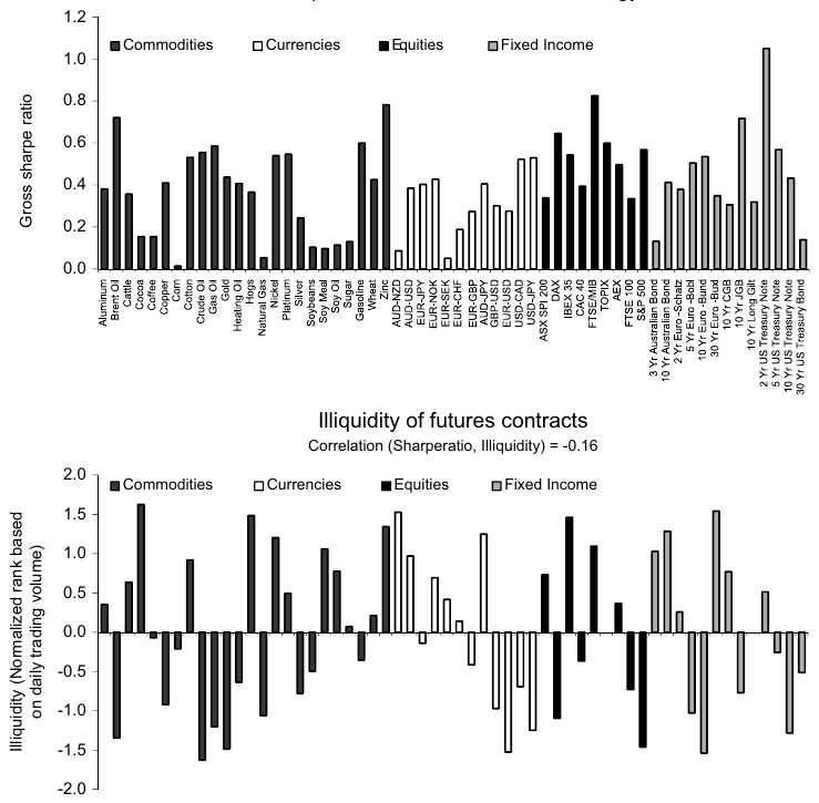
How to read it. At the top the horizontal axis lists all contracts grouped by asset class, and the vertical axis shows the annual Sharpe ratio of the strategy on each of them separately. The axis is labeled
Gross sharpe ratio: this is the Sharpe ratio before costs. At the bottom is the illiquidity measure: the contract's rank by daily volume within its class, normalized; a positive value means less liquid than the median contract of the class. Above the bottom panel is the captionCorrelation (Sharperatio, Illiquidity) = -0.16.What to notice. All bars in the top panel are above zero, some of them with a Sharpe ratio below 0.2, and the highest is about 1, for US two-year bonds. The text:
"every single futures contract exhibits positive predictability", all 58 positive, 52 significant at the 5 % level.Why the bottom panel. It answers the objection “the effect lives only in illiquid corners of the market”. The correlation is −0.16, that is, in the authors' words,
"if anything, more liquid contracts exhibit greater time series momentum profits".
If each instrument's TSMOM is regressed on the “always long” strategy for the same instrument, alpha is positive in 90 % of cases, 26 % of them significant, and none of the few negative ones is significant. So the trend adds something beyond a passive long for most instruments.
Table 3 summarizes the result of the diversified portfolio:
| Regression | MSCI World | SMB | HML | UMD | Alpha | R² |
|---|---|---|---|---|---|---|
| Monthly | 0.09 (1.89) | −0.05 (−0.84) | −0.01 (−0.21) | 0.28 (6.78) | 1.58 % a month (7.99) | 14 % |
| Quarterly | 0.07 (1.00) | −0.18 (−1.44) | 0.01 (0.11) | 0.32 (4.44) | 4.75 % a quarter (7.73) | 23 % |
How to read it. t-statistics in parentheses. A coefficient of 0.09 on MSCI World means the strategy is almost unrelated to the equity market. The only noticeable link is with UMD, US cross-sectional equity momentum: 0.28 with t = 6.78. Both strategies are about persistence, so this is expected. But an alpha of 1.58 % a month with t = 7.99 remains, so TSMOM does not reduce to UMD. An R² of 14 % means the factors explain only a small part of the strategy's moves. The quarterly regression is there in case markets trade asynchronously.
Against the value and momentum “everywhere” factors of Asness, Moskowitz and Pedersen (they are built across many asset classes at once), the loading on momentum is 0.66 (t = 9.74), and alpha falls but remains: 1.09 % a month with t = 5.40 at an R² of 30 %, or 2.93 % a quarter with t = 4.12.
The overall description in the text: the diversified portfolio's annual Sharpe ratio is above one, about 2.5 times the Sharpe ratio of the equity market. In the early sample 1966–1985, with few instruments, the annual Sharpe ratio is 1.1 and significant; this check, as footnote 9 says, was requested by the referee.
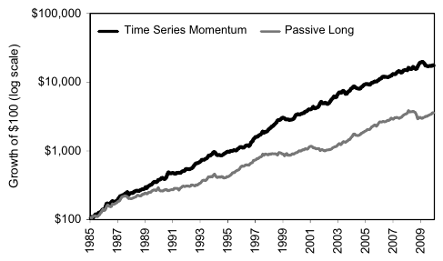
How to read it. Growth of $100 on a log scale from 1985 to 2009. Black line: TSMOM, gray: a passive long in all contracts with the same risk per instrument. On a log scale equal distances mean equal percentages, so the early years are not squashed near zero.
What to notice. Both lines rise, the trend line higher and smoother. At the end of 2008 it jumps up while the passive long dips. In 2009 the trend line has a noticeable pullback.
The authors examine 2008 in detail. In the third quarter the strategy lost money as it turned short in many contracts. In October–December, at the height of the crisis, it earned big: commodities and equities kept falling, bonds rose, currencies moved sharply. In March–May 2009, when the crisis ended with a sharp reversal, it suffered sharp losses. The end of a crisis is precisely a sharp change of trend, and that is where a trend strategy loses.
7. The smile: best in extreme markets
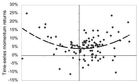
How to read it. Each point is one quarter. The horizontal axis is the S&P 500 return (the axis labels did not make it into the crop; in the paper the scale runs from −25 % to 25 %), the vertical one the TSMOM return. The dashed curve is a fitted parabola.
What to notice. The points lie not along a sloping line but in a bowl: the strategy's highest returns sit at the left and right edges, in the quarters of the strongest declines and rises. In the middle the results are modest.
A regression test of this is in panel C of Table 3: the quarterly TSMOM return on the MSCI World return and its square. The coefficient on the market return itself is −0.01 (t = −0.17), on the square 1.99 (t = 3.88).
What the coefficient on the square means. Squaring removes the sign: both −20 % and +20 % give 0.04. So this term answers whether the strategy's result is related to the size of the market move, regardless of direction. A positive significant coefficient: the harder the market moved, the better for the strategy.
What a straddle is. An option position in which the right to sell and the right to buy are bought at the same time. It earns on any strong move and loses a little when nothing happens. The authors write:
"TSMOM, therefore, has payoffs similar to an option straddle", although there are no options in the strategy, and cite Fung and Hsieh (2001), who explained this payoff shape in trend-following funds.
From this the authors draw a cautious conclusion: the average TSMOM return is unlikely to be compensation for crash risk. Historically the strategy came through crises well, because a crisis usually develops from a normal state to a bad one (the strategy goes short risky assets) and from bad to worse (the strategy earns). Hence also the words "may be a hedge for extreme events": may be, not is.
The same panel tests and rejects other explanations. Neither the TED spread (a measure of stress in bank funding), nor the VIX, nor the Baker–Wurgler investor sentiment indices, nor their changes, nor the 20 % most extreme values of these quantities give significant coefficients.
8. Correlations of strategies are higher than correlations of markets
Table 4 compares the correlations of trend strategies with the correlations of passive longs in the same instruments, on monthly returns for 1985–2009.
| Commodities | Equities | Bonds | Currencies | |
|---|---|---|---|---|
| Average pairwise TSMOM correlation within the class | 0.07 | 0.37 | 0.38 | 0.10 |
| The same for the passive long | 0.19 | 0.60 | 0.63 | −0.04 |
Within an asset class trend strategies are less correlated than the markets themselves (except currencies). Across classes the picture is reversed. TSMOM correlations across classes are all positive, from 0.05 to 0.21. Many of the passive longs' correlations are negative: for example, commodities and bonds −0.12, while the trend strategies on commodities and on bonds are +0.07. For every pair of classes the correlation of trend strategies is higher than that of passive positions.
Why this matters. The authors infer a common component that affects trend strategies in all asset classes at once and that is absent from the assets themselves. In practice this means that the diversification of a trend portfolio cannot be judged by the correlations of the underlying markets: “commodities, bonds, currencies and equities are almost unrelated” does not mean that the strategies on them are unrelated.
9. Time-series and cross-sectional momentum: the same food
Regressing TSMOM on the cross-sectional momentum of the same assets (XSMOM) gives a beta of 0.66 (t = 15.17) and an R² of 44 %, but alpha remains: 0.76 % a month with t = 5.90. The strategies are related but not identical. For XSMOM the authors, following Asness, Moskowitz and Pedersen, exclude the most recent month from the 12-month window and write in footnote 10 that the results do not depend on this.
To understand where the two strategies' profits come from, the authors decompose their expected value into parts following Lo–MacKinlay and Lewellen. For this, in this section the portfolio is built not by sign but linearly: an instrument's weight is proportional to its past return.
What happens here, without formulas. The strategy's profit is broken down into items, like a restaurant bill. There are three sources. First: an instrument predicts itself (oil rose and will keep rising); this is autocovariance. Second: one instrument predicts another (oil rose, and a month later another market rose); these are cross effects, also known as “lead and lag”. Third: instruments simply have different mean returns, and the “buy what rises” strategy more often holds what rises on average, without any prediction.
What each symbol means.
- : the expectation, the long-run average.
- : the number of instruments.
- (“omega”): an table; the “oil, gold” cell holds the covariance of oil's past annual return with gold's future monthly return.
- (“trace”): the sum of the numbers on the diagonal, where row and column are the same instrument. This is source 1.
- : the sum of all numbers in the table; net of the diagonal, this is source 2.
- (“mu”): the vector of mean monthly returns; their dispersion across instruments, the mean square of the means. This is source 3.
- The factor 12 links the signal's annual return to the return of the holding month. The authors note in footnote 11 that the relationship is exact for additive returns and approximate for compounded ones.
The main thing to read from the two lines. Cross-sectional momentum has all three sources, with the cross effects entering with a minus sign. Time-series momentum has no cross term at all: the strategy looks only at each instrument's own history. If mean returns are small, time-series momentum rests almost entirely on autocovariance.
| XSMOM: Auto | Cross | Mean | Total | TSMOM: Auto | Mean² | Total | |
|---|---|---|---|---|---|---|---|
| All assets | 0.53 % | −0.03 % | 0.12 % | 0.61 % | 0.54 % | 0.29 % | 0.83 % |
| Commodities | 0.41 % | −0.13 % | 0.11 % | 0.39 % | 0.43 % | 0.17 % | 0.59 % |
| Equities | 0.74 % | −0.62 % | 0.02 % | 0.14 % | 0.83 % | 0.17 % | 1.00 % |
| Bonds | 0.32 % | −0.10 % | 0.05 % | 0.27 % | 0.35 % | 0.70 % | 1.05 % |
| Currencies | 0.71 % | −0.55 % | 0.02 % | 0.18 % | 0.80 % | 0.17 % | 0.96 % |
How to read it, on the “Equities” row. Cross-sectional momentum earns 0.74 % from self-prediction, loses 0.62 % on cross effects and adds 0.02 % from differences in means, 0.14 % in total. Time-series momentum earns 0.83 % from self-prediction, loses nothing on cross effects and adds 0.17 % from the means, 1.00 % in total.
The “Bonds” row. Here Mean² is 0.70 % out of 1.05 %: more than half of the expected profit of time-series momentum on bonds comes not from predictions but from the positive mean return of bonds over the sample. The authors say exactly that: mean squares give a small part of TSMOM's profit,
"except for fixed income".
Panel C of Table 5 turns the question around: TSMOM is on the right-hand side and explains other strategies.
| Dependent variable | Beta on TSMOM | Alpha | R² |
|---|---|---|---|
| XSMOM, all assets | 0.66 (15.17) | −0.16 % (−1.17) | 44 % |
| XSMOM, commodities | 0.65 (14.61) | −0.09 % (−0.66) | 42 % |
| XSMOM, equity indices | 0.39 (7.32) | 0.29 % (1.86) | 15 % |
| XSMOM, bonds | 0.37 (6.83) | −0.14 % (−0.87) | 14 % |
| XSMOM, currencies | 0.75 (19.52) | −0.19 % (−1.71) | 56 % |
| UMD | 0.49 (6.56) | −0.28 % (−0.93) | 13 % |
| HML | −0.07 (−1.46) | 0.43 % (2.08) | 1 % |
| SMB | −0.01 (−0.26) | 0.10 % (0.49) | 0 % |
| DJCS Managed Futures | 0.55 (9.60) | −0.30 % (−1.37) | 33 % |
| DJCS Global Macro | 0.32 (5.64) | 0.52 % (2.38) | 14 % |
How to read it. If the alpha in a row is insignificant (t-statistic below 2 in absolute value), the mean return of that strategy is explained by its loading on TSMOM.
The two strongest results. First: UMD, momentum in individual US stocks. It has not a single instrument in common with TSMOM, stocks there, futures on indices, commodities, currencies and bonds here, and yet UMD's alpha is insignificant. Second: the Dow Jones/Credit Suisse managed futures fund index for 1994–2009. Beta 0.55, alpha insignificant, and the authors write that the TSMOM factor
"captures its average return entirely". The index's mean return is explained, but R² is 33 %: two thirds of the index's fluctuations are not explained by the factor. The Global Macro index retains a significant alpha.
10. Who trades the trend: speculators and hedgers
CFTC data: the regulator requires large futures market participants to report their positions and to classify themselves as commercial (conventionally regarded as hedgers) or non-commercial (speculators). The data are weekly, from 1986 to 2009, and do not cover all contracts in the sample: most commodities and currencies, and among equities and bonds only US ones.
What this is. The speculators' imbalance to one side divided by the total number of open contracts, so that a large market can be compared with a small one. A value of 0.20 means that the speculators' net long equals 20 % of open interest. Hedgers, after adjusting for small participants, stand exactly on the other side, so the authors look only at speculators.
Who these two are. A hedger is a producer or consumer of the commodity: a farmer selling the future harvest, an airline locking in the price of fuel. They need certainty, not profit. A speculator takes risk for profit.
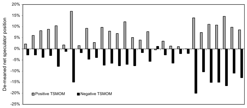
How to read it. The horizontal axis lists the contracts with CFTC data. The light bar (
Positive TSMOM): the average speculator position in months when the return over the past 12 months was positive; the dark bar (Negative TSMOM): when it was negative. Both are net of the contract's average position.What to notice. Almost everywhere the light bar is above zero and the dark one below: speculators stand with the trend. The exception is one contract whose signs are reversed and close to zero; in the text it is the S&P 500.
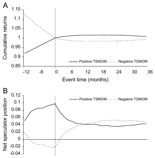
How to read it. Zero on the horizontal axis is the formation date: we look at the past year's return and decide long or short. Solid line: cases with a positive past year, dashed: with a negative one. Panel A: cumulative return, demeaned and normalized to one at formation. Panel B: net speculator position in the same months.
What to notice. To the left of zero the lines diverge by construction. To the right the return keeps going in the same direction for about a year and then partially reverses. Speculator positions grow before formation, and after it they return to their averages and level off roughly a year later, just when the trend begins to reverse. Under a negative trend, according to the authors, possibly a little longer.
Hence the authors' conclusion: speculators do not chase the trend late but reduce their position by the time the trend's profit disappears. Hedgers on the other side build up positions in the direction of the trend. So if the overreaction is caused by anyone's trading, it would have to be the hedgers', not the speculators'. The authors explicitly call the causality between returns and positions uncertain, and their wording matches: speculators "appear to be profiting" from trends at the expense of hedgers.
The same conclusion is checked with a vector autoregression: monthly returns and changes in speculator positions, 24 lags, coefficients common to all contracts, the shock decomposed by Cholesky. There are more than 12 lags in order to capture the delayed reversal; according to the authors, the result is robust to between 12 and 24 lags.
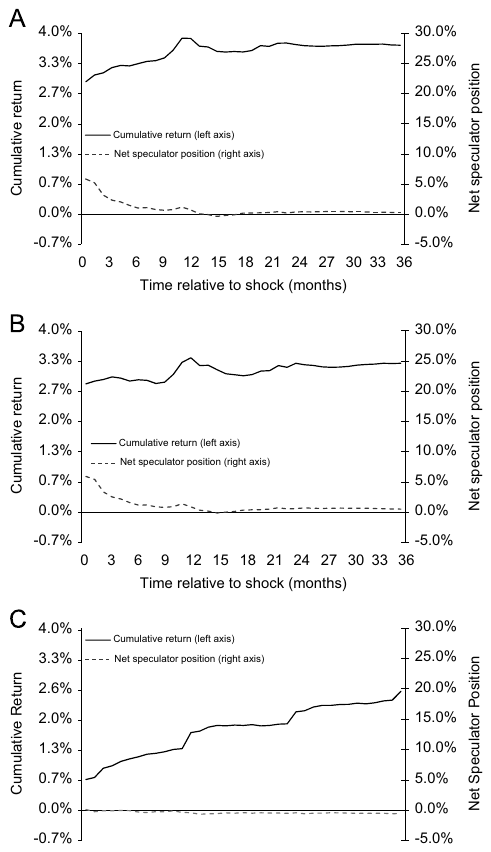
How to read it. The horizontal axis shows months after a one-standard-deviation shock; the solid line (left scale): cumulative return, dashed (right scale): speculator position. Panel A: a shock to the total futures return, B: to the spot price only, C: to the roll return only.
What to notice. Panels A and B are similar: the return rises for about a year, then partially pulls back, and the speculator position rises with the shock and returns to zero by the one-year mark. Panel C is different: the return rises for all 36 months and does not reverse, and the speculator position barely reacts.
11. Spot and roll: two different sources of trend
The authors decompose the 12-month futures return into the change in the spot price in excess of the risk-free rate and the roll return:
What roll return is. Futures with different maturities have different prices. Our example: the nearby oil contract costs 80, the next one 78. Holding a long, before expiration you sell the nearby and buy the next one cheaper; as delivery approaches it converges to spot, and you earn on the rolling even if the oil price stood still. If the next contract is more expensive than the nearby, each roll costs money. For financial futures with low storage costs the roll, according to the authors, is close to zero; for commodities it can be substantial.
Why separate them. The authors' hypothesis: spot moves on information, and the roll on pressure from hedgers willing to pay for insurance. If hedgers, for example commodity producers, sell futures en masse, the roll return is positive; Keynes called this normal backwardation.
Table 6 gives regressions of the monthly futures return on these predictors separately and together. Separately all of them are significant: the total 12-month return (coefficient 0.019, t = 3.57), the spot change (0.014, t = 2.29), the roll (0.024, t = 3.22), the change in net speculator position (0.007, t = 2.67) and its level (0.007, t = 2.33). Together with the past return, the change in speculator positions loses significance (0.004, t = 1.65). The authors read this as follows: the roll and speculator positions measure the same hedging pressure, each in its own way and imprecisely.
Our remark: the R² of these monthly regressions, per Table 6, ranges from 0.2 % to 0.8 %. Predictability is statistically significant on a large panel, but the share of explained variance in any single month is very small. This is usual for monthly return forecasts, and the paper does not discuss it separately.
Together with Figure 7 the conclusion is this. Both spot and roll predict, but only spot shocks partially reverse: "only shocks to price changes partially reverse". This is consistent with a delayed overreaction to information in the spot price. Hedging pressure, reflected in the roll, lasts longer and does not reverse: hedgers hold positions in one direction for a long time and are willing to give up roll return for the sake of the hedge, while speculators receive it as payment for providing liquidity.
12. What is shaky in the paper
The authors' own caveats
The CFTC classification is crude. Commercial participants include speculators too. The authors write in footnote 6 that classification error adds noise, but such a bias "may only weaken our results".
Illiquidity is measured with a single snapshot. The authors have no historical volume series, and they "use a snapshot of their daily volume in June 2010" to compare contracts over the entire history since 1985.
Causality is not established. The authors call the direction of causality between positions and returns uncertain. The statement “speculators profit at the expense of hedgers” describes joint dynamics, not a proven mechanism.
The explanation is open. The authors do not rule out a rational theory that would explain the results, and the existing behavioral models, in their words, do not explain why trend strategies in different asset classes are more correlated than the assets themselves, and why different investors in different markets produce the same pattern at the same time.
Spliced series. Where futures did not yet exist, cash indices are used: MSCI for equities, JP Morgan for bonds, spot and interbank rates for currencies. For equity indices the authors check that the futures series are "almost perfectly correlated" with the cash indices in excess of the Treasury bill rate, and that the results on cash indices are almost the same.
What is visible on reading but not discussed in the paper
There are no costs. Neither the Sharpe ratios nor the alphas account for commissions, spreads or slippage; the axis of Figure 2 is labeled accordingly: Gross sharpe ratio. For a strategy with monthly rebalancing and equal risk across 58 markets, the costs of rolling and rebalancing are not zero, especially for commodities.
The sample ends in 2009. The paper was published in 2012, and its main period is 1985–2009. How the strategy behaved after the financial crisis cannot be learned from it; this is partly covered by later papers that extend the same factor.
The early check uses a small set. The annual Sharpe ratio of 1.1 for 1966–1985 is obtained on a small number of instruments, and neither their composition nor a table for that period is given in the paper.
A primitive volatility estimate. This is the authors' deliberate choice to avoid fitting, but it means the paper's numbers describe one specific implementation, not an upper bound on what a trend signal can deliver.
13. What follows in practice
The signal is simple, the position construction is not. The sign of the 12-month return takes one line of code. Everything that gives this line a Sharpe ratio above one at the portfolio level sits elsewhere: forecast volatility lagged by one period, scaling positions to equal risk, and equal weights across many uncorrelated markets. Without the scaling, natural gas and sugar will rule the portfolio, and bonds will be barely visible in it.
Robustness across parameters matters more than the best parameter. Table 2 is significant across the whole quadrant from 1 to 12 months for both periods. A reasonable acceptance criterion for a trend backtest: the result holds with a window of 6, 9 and 12 months, not only at a single value.
A negative mean market return does not hinder the trend. Corn, natural gas and wheat, with negative means, enter the strategy on equal terms with the rest, and the strategy is in profit on each of them. Select markets for a trend basket by liquidity, not by the asset's own attractive history.
Where the losses come is predictable. The trend loses on sharp reversals from a bad state to a good one, as in March–May 2009. This is a consequence of the construction, not a malfunction.
Compute correlations for strategies, not for markets. Trend strategies on different asset classes are more closely related than the classes themselves. A diversification estimate based on the correlations of the underlying assets will be too optimistic.
There is a benchmark for checking your own implementation. The TSMOM factor can be built from the paper's description, and the managed futures index loads on it with a beta of 0.55. If your own futures trend strategy shows no significant alpha against such a factor, it most likely just replicates it. And a Sharpe ratio for the same construction noticeably above the one stated in the paper (above 1 before costs) should be treated as a sign of an error in your implementation: look-ahead, incorrect contract splicing, forgotten costs.
14. Testable ideas
| No. | Idea | Type | Where to compute |
|---|---|---|---|
| 1 | For a trend strategy, build the full grid of t-statistics “look-back × holding” from 1 to 48 months and accept the strategy only if significance covers a connected region rather than isolated cells | acceptance metric | backtester |
| 2 | Check in all strategies with volatility-scaled positions that the estimate is taken strictly at , not at | audit | backtester |
| 3 | Decompose the expected profit of your trend basket into autocovariance and the mean square of the means (equation 7): if the second term dominates, it is a hidden market long | diagnostic | Python |
| 4 | Compare the correlation matrix of trend strategies with the correlation matrix of the markets themselves; if the former is higher across classes, a market-based diversification estimate is overstated | diagnostic | Python |
| 5 | Regress the trend basket's quarterly return on the market return and its square: a significant positive coefficient on the square confirms the straddle profile, and its absence requires an explanation | diagnostic | Python |
| 6 | Build the TSMOM factor from the paper's description (12 months, 40 % per position, equal weights) and regress every new trend development on it; an insignificant alpha means the strategy replicates it | acceptance metric | Python |
| 7 | Repeat the event study (from −12 to +36 months around formation) on post-2009 data and check whether the break around 12 months has persisted | diagnostic | Python |
| 8 | Use the change in net speculator position from CFTC reports as a filter on top of the trend, not as a standalone signal: in the paper it loses significance when controlling for past return | design change | Python |
| 9 | On commodity futures, build the trend signal separately on the spot price and on the roll return, and check whether the roll signal persists longer | design change | Python |
| 10 | Check whether markets entered your trend basket because of the asset's attractive history; select by liquidity and compare the result | audit | any |