How to read this walk-through. The paper has no formulas: it is all tables and charts. The main points are in section 3 (the table by decade) and in section 6 (what happens in crises). Sections 4 and 8 are needed if you build a trend strategy yourself: they cover signal delay and what the result depends on. We did not recompute the numbers; all of them come from the paper's tables.
The main thesis
The paper answers one question: are the good results of trend strategies in recent decades a statistical fluke or a persistent phenomenon? To answer it, the authors extend the history back by more than a hundred years, to 1880, and apply a rule fixed in advance.
The answer: time-series momentum delivered a positive average return in every decade since 1880, with low correlation to stocks and bonds. It was positive in 8 of the 10 largest crises of a “60 % stocks, 40 % bonds” portfolio and performed similarly across macroeconomic regimes. The correlation across markets had the strongest effect on results: the lower it was, the better.
The authors state the limit of their claim directly: "we are not claiming that this strategy would have been implementable as described back in the 1880s". There were no futures on equity indices or bonds then, and no modern financing either. The stated goal is narrower: "The main point of the study is to show that markets have exhibited statistically significant trends for well over a century".
1. Data: 67 markets and 137 years
Monthly returns of 67 markets: 29 commodities, 11 equity indices, 15 bond markets and 12 currency pairs. The main novelty is in commodities: the authors hand-digitized daily futures prices from the annual reports of the Chicago Board of Trade (“Annual Report of the Trade and Commerce of the Chicago Board of Trade”), from 1877 up to 1951, when electronic data begin. To rule out transcription errors, "two independent data vendors transcribed the same data set", and their transcriptions were checked against each other.
The futures roll is simulated by two simultaneous trades: selling the old contract and buying the next one, both at current prices. In the early part of the sample there are no closing prices, only the high and the low, and their average is used. In the digitized data each month the nearest contract with at least two months to delivery is held.
For stocks, bonds and currencies there are no futures before 1877, and until they appear cash indices financed at the local short rate are used. According to the authors, by the 1980s most returns are already futures returns, while the commodity part is futures over its whole length and is therefore the most realistic.
What “financed at the short rate” means. A future does not require full payment, while an equity index does. To make them comparable, the interest on a short-term loan is subtracted from the index return: as if the money had been borrowed, the index bought, and the loan paid for. The result is a number comparable with a futures return.
The strategy needs three years of history to estimate volatility, so its results start in 1880. Not all 67 markets have data in every month: the strategy trades whatever set of markets is available at the time. Appendix A of the paper lists the sources by market and period.
In footnote 5 the authors explain why futures prices in particular matter. Similar long studies on spot prices, in their words, "are not implementable": even if the spot trends, trading the trend in futures will not make money if futures prices already reflect the trend on average.
2. The method in one line
Each month, for each market, three signals: the sign of the excess return over 1, 3 and 12 months; plus means long, minus means short, and the strategy is always in a position; each position has the same target volatility; the three strategies are averaged with equal weights, and the whole portfolio is scaled to a forecast volatility of 10 % a year.
The methodology follows the paper by Moskowitz, Ooi and Pedersen (2012) and the authors' own paper on managed futures funds (Hurst, Ooi, Pedersen, 2013), and therefore, in the authors' words, "can thus be viewed as an out-of-sample test of those papers". The covariance matrix for scaling the portfolio is estimated on a rolling three years of monthly returns with equal weights.
What a “10 % volatility target” means. You decide in advance how much the account should swing and size all positions so that the expected annual swing is about 10 %. This makes results from different eras comparable: without scaling, the strategy would barely move in calm years and would swing twice as hard in turbulent ones. In the table below the realized volatility by decade ranges from 8.1 % to 12.6 %.
Next, costs and fees are deducted.
Costs. One-way costs per trade by asset class, including market impact and commissions, are "proprietary estimates" from 2012. For 1993–2002 they are doubled, for 1880–1992 multiplied by six, based on estimates from Jones (2002) on the historical liquidity of the stock market.
| Asset class | 1880–1992 | 1993–2002 | 2003–2016 |
|---|---|---|---|
| Stocks | 0.34 % | 0.11 % | 0.06 % |
| Bonds | 0.06 % | 0.02 % | 0.01 % |
| Commodities | 0.58 % | 0.19 % | 0.10 % |
| Currencies | 0.18 % | 0.06 % | 0.03 % |
How to read it. The cost of one trade in one direction as a percentage of turnover. Buying a commodity future worth 100 units cost 0.58 units in the simulation before 1993 and 0.10 after 2003. Both estimates, in the authors' words, are made
"with a significant amount of uncertainty", and the costs of rolling futures are not included in the simulation at all.
Fees. 2 % a year for management and 20 % of profits with an annual high-water mark: the performance fee for a year is charged only if the fund's value at year end is above all previous year-end values. The authors note in footnote 8 that some managers used to charge more in the past, and today some charge less for this strategy.
What “2 and 20” and the high-water mark are. The usual hedge fund fee scheme. 2 % is charged on assets regardless of the result, 20 % on profits. The high-water mark means no fee is paid on profits until a past loss has been recovered: if the account fell from 100 to 80 and rose to 95, there is no performance fee.
3. Results by decade
Exhibit 1 of the paper, annual returns over the risk-free rate:
| Period | Gross | After costs | After costs and 2/20 | Volatility | Sharpe after all | Corr. with US stocks | Corr. with US 10-year bonds |
|---|---|---|---|---|---|---|---|
| 1880–2016 | 18.0 % | 11.0 % | 7.3 % | 9.7 % | 0.76 | −0.01 | −0.03 |
| 1880–1889 | 12.1 % | 5.2 % | 2.6 % | 9.5 % | 0.27 | −0.11 | −0.04 |
| 1890–1899 | 17.4 % | 10.0 % | 6.5 % | 8.9 % | 0.73 | −0.02 | −0.15 |
| 1900–1909 | 15.3 % | 6.0 % | 3.3 % | 9.5 % | 0.34 | 0.02 | −0.35 |
| 1910–1919 | 12.5 % | 4.1 % | 1.6 % | 12.6 % | 0.13 | 0.12 | −0.01 |
| 1920–1929 | 20.8 % | 13.3 % | 9.2 % | 8.5 % | 1.09 | 0.15 | 0.06 |
| 1930–1939 | 15.4 % | 9.8 % | 6.3 % | 8.6 % | 0.74 | −0.11 | 0.20 |
| 1940–1949 | 23.8 % | 14.8 % | 10.4 % | 10.6 % | 0.99 | 0.33 | 0.31 |
| 1950–1959 | 26.7 % | 17.6 % | 13.1 % | 9.1 % | 1.45 | 0.23 | −0.19 |
| 1960–1969 | 21.0 % | 9.5 % | 6.0 % | 10.9 % | 0.56 | −0.09 | −0.37 |
| 1970–1979 | 27.4 % | 20.5 % | 15.1 % | 8.9 % | 1.70 | −0.24 | −0.25 |
| 1980–1989 | 20.1 % | 13.3 % | 9.1 % | 9.4 % | 0.96 | 0.18 | −0.16 |
| 1990–1999 | 16.8 % | 12.3 % | 8.3 % | 8.4 % | 0.98 | 0.01 | 0.21 |
| 2000–2009 | 11.6 % | 9.9 % | 6.3 % | 10.3 % | 0.61 | −0.34 | 0.27 |
| 2010–2016 | 7.6 % | 6.2 % | 3.3 % | 8.1 % | 0.41 | −0.15 | 0.28 |
What this is. The Sharpe ratio: how much return over the risk-free rate there is per unit of fluctuation.
What each symbol means. (“r bar”): the strategy's average annual return; (“r f”): the risk-free rate; (“sigma”): annual volatility. In the table returns are already over the rate, so the Sharpe is simply return divided by volatility.
A worked example on the paper's numbers. Over the full sample after costs and fees the excess return is 7.3 % with volatility of 9.7 %, and the Sharpe in the table is 0.76. Return must be divided by volatility for the same period and after the same deductions.
Why this matters. This is the only way to compare two strategies with different risk. 15 % a year at 30 % volatility is worse than 7.3 % at 9.7 %.
What the table shows first. Between 18.0 % gross and 7.3 % net on the full sample there are more than 10 percentage points: more than half of the gross return goes to costs and the manager's compensation. In the 1880s, of 12.1 % gross, 2.6 % remains, about a fifth; after costs alone, where the sixfold multiplier applies, 5.2 % remains. Correlations with stocks and bonds on the full sample are about zero and in no decade exceed 0.37 in absolute value.
Our remark: after the 1970s the Sharpe after all deductions broadly declines: 1.70, 0.96, 0.98, 0.61, 0.41. The authors do not discuss this series separately. Based on it, they write that the result "has been surprisingly consistent" over the whole length, that the distant past is "out-of-sample evidence relative to the literature", and conclude that the existence of trends is unlikely to be explained by chance or data mining.
Why trends exist at all, the authors explain by reference to the literature: behavioral biases of investors (anchoring, herding) and the trading of participants who do not seek profit, such as central banks and corporate hedging programs. A central bank that smooths moves in a currency or in rates can slow the incorporation of information into the price and thereby create a trend. The authors give this explanation as likely, not as proven in the paper.
4. Signals separately and a one-month delay
Exhibit 2 of the paper shows the Sharpe before costs and fees for each signal separately and for a version where the trade is executed a month later: the signal is computed on the last trading day of January, and the trade at the end of February.
| Period | 1 mo. | 1 mo., delayed | 3 mo. | 3 mo., delayed | 12 mo. | 12 mo., delayed |
|---|---|---|---|---|---|---|
| 1880–2016 | 1.38 | 0.45 | 1.19 | 0.64 | 1.32 | 1.04 |
| 1880–1889 | 1.02 | −0.34 | 0.78 | −0.23 | 1.03 | 0.89 |
| 1960–1969 | 1.81 | 0.31 | 1.31 | 0.68 | 1.01 | 0.42 |
| 1970–1979 | 2.24 | 0.82 | 2.13 | 1.34 | 1.91 | 1.66 |
| 2000–2009 | 0.70 | 0.38 | 0.67 | 0.66 | 1.10 | 0.86 |
| 2010–2016 | 0.06 | 0.13 | 0.30 | 0.33 | 0.73 | 0.70 |
Why such a test. It shows whether the strategy rests on the effect itself or on execution speed. If the delay barely hurts, the signal is slow and tolerates any infrastructure. If the result falls apart, the money comes from speed, and any hitch in execution will eat it.
What the numbers say. On the full sample the 12-month signal loses about a fifth of its Sharpe from the delay (from 1.32 to 1.04), the 1-month signal about two thirds (from 1.38 to 0.45). The authors write that the delayed results are positive in most decades but deteriorate,
"especially for the shorter-term signals". In the 1880s the delayed 1-month and 3-month signals are negative.
One more thing is visible in the last row, and the authors do not comment on it separately: in 2010–2016 the 1-month signal gave a Sharpe of 0.06 before any costs, the 3-month 0.30, and the 12-month 0.73. Fast trend almost disappeared in this period, slow trend survived.
5. By individual market
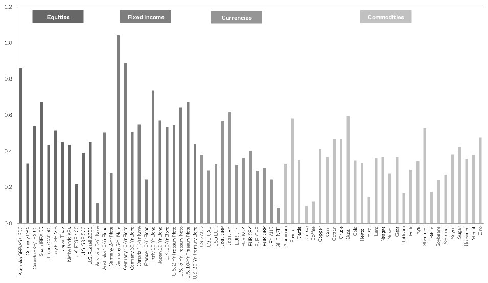
How to read it. Along the horizontal axis all 67 markets in four groups: stocks, bonds (Fixed Income), currencies, commodities. On the vertical axis the Sharpe of the strategy on each market separately, before costs and fees, 1880–2016.
What to notice. All bars are above zero. The authors write of a positive average return in every market
"with an average Sharpe ratio of approximately 0.4". The highest are German 5- and 10-year bonds (about 1.0 and 0.9), the lowest about 0.1 (Australian 3-year bonds, AUD/NZD, cocoa).Why this is stronger than the portfolio Sharpe. A portfolio figure can rest on a few lucky markets. Here the effect is visible on each one separately.
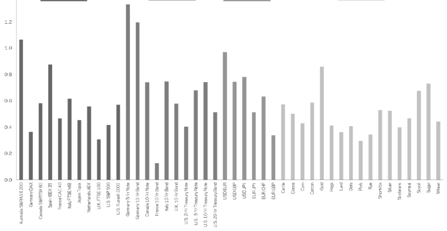
How to read it. The same chart computed on 1880–1984 data for markets that have at least 10 years of history in that period. The paper's caption: these data are out-of-sample relative to the study by Moskowitz, Ooi and Pedersen (2012), which started in 1985.
What to notice. All bars are again positive, most with a Sharpe from 0.3 to 0.8; the lowest, about 0.1, is French 10-year bonds. The authors call this
"remarkably consistent performance across markets and asset classes".
6. Crises: the smile and the worst 60/40 drawdowns
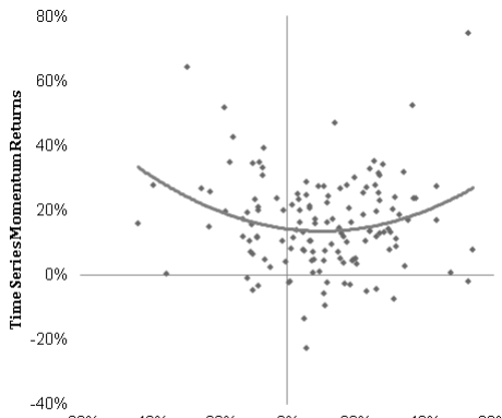
How to read it. Each dot is one year. On the horizontal axis the return of the US stock market (the axis labels are cut off in the crop), on the vertical axis the return of the trend strategy before fees but after costs. The line: a fitted second-degree polynomial.
What to notice. The dots form a bowl: the strategy's best years fall on the years of the strongest market declines and the strongest rallies. This is the same “smile” as in the 2012 paper on 1985–2009 data, only over a much longer period that includes that one.
A second view of crises: the 10 worst peak-to-trough drawdowns of a 60/40 portfolio (60 % in US stocks, 40 % in US 10-year bonds, rebalanced monthly, without fees or costs) and what the trend strategy did in those periods.
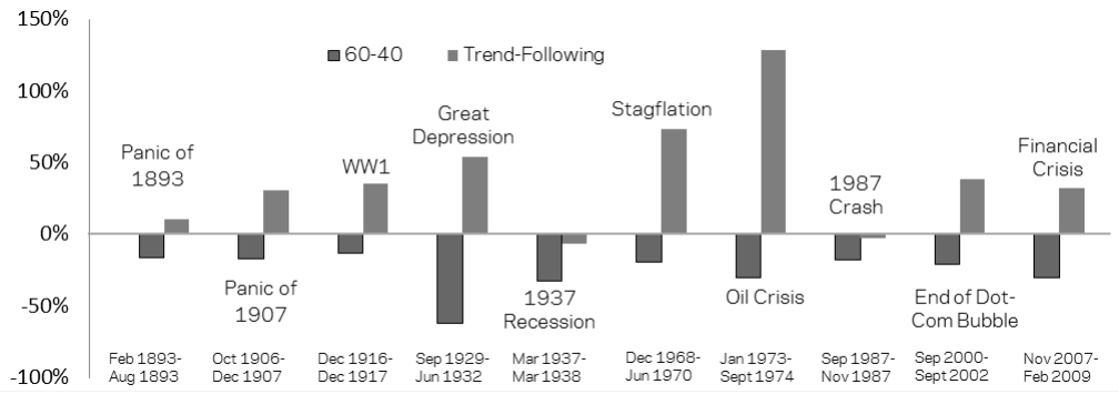
How to read it. Dark bar: the 60/40 portfolio, light bar: the trend strategy. The periods are labeled on the chart: the panic of 1893, the panic of 1907, World War I (December 1916 – December 1917), the Great Depression (September 1929 – June 1932), the 1937 recession, stagflation (December 1968 – June 1970), the oil crisis (January 1973 – September 1974), the 1987 crash, the end of the dot-com bubble, the financial crisis (November 2007 – February 2009).
What to notice. The dark bars all point down by construction. The light ones point up in eight cases out of ten, sometimes very high: about +130 % in the oil crisis, about +75 % in stagflation, about +55 % in the Great Depression. Two exceptions with a small loss: the 1937 recession and the 1987 crash.
The authors' explanation: most bear markets developed gradually, over several months, rather than collapsing within a few days. This gives a trend strategy time to flip to short after the first decline and profit from the continuation. The average length of these ten peak-to-trough drawdowns is about 15 months. In a fast crash like October 1987 the strategy, in the authors' words, "may not perform as consistently": it does not have time to take a position.
The practical takeaway. Trend is a diversifier against prolonged bear markets, not insurance against a sudden crash. Buying it as protection against a one-day fall means expecting from it something that has not happened in history.
Exhibit 7 shows what a trend allocation in an ordinary portfolio would have given over 1880–2016:
| Portfolio | Return over cash | Volatility | Max. drawdown | Sharpe |
|---|---|---|---|---|
| 60/40 | 4.1 % | 10.7 % | −62.3 % | 0.39 |
| 80 % in 60/40 and 20 % in trend | 4.8 % | 8.7 % | −50.2 % | 0.55 |
What maximum drawdown is. The deepest fall from a peak reached to the subsequent trough. −62.3 % means there was a moment when the portfolio was worth 62 % less than on its best day. It measures what you will have to live through, not how much you will earn.
What to pay attention to. The 60/40 portfolio is taken before fees and costs, and the trend part after fees and costs. The comparison is tilted in favor of 60/40, and trend still improves all four measures.
7. The trend strategy's own drawdowns
The strategy itself also has hard periods: in the authors' words, these are sharp reversals in many markets at once or long periods when many markets have no clear trends. Exhibit 8, before fees, after costs:
| No. | Start | Trough | Recovery | Depth | Length of decline, mo. | Length of recovery, mo. |
|---|---|---|---|---|---|---|
| 1 | Aug 1947 | Dec 1948 | Feb 1951 | −24.7 % | 16 | 26 |
| 2 | Apr 1912 | Jan 1913 | Aug 1914 | −22.8 % | 9 | 19 |
| 3 | Feb 1937 | Jun 1940 | Aug 1941 | −21.2 % | 40 | 14 |
| 4 | Mar 1918 | Feb 1919 | Feb 1920 | −20.4 % | 11 | 12 |
| 5 | Aug 1966 | Dec 1966 | Mar 1968 | −17.7 % | 4 | 15 |
| 6 | Jun 1964 | Aug 1965 | Dec 1965 | −17.2 % | 14 | 4 |
| 7 | Mar 2015 | May 2016 | not recovered by end of 2016 | −16.1 % | 14 | n/a |
| 8 | Aug 1896 | Jun 1897 | Dec 1898 | −15.0 % | 10 | 18 |
| 9 | Apr 1885 | Jun 1885 | Jul 1887 | −14.4 % | 2 | 25 |
| 10 | Feb 1904 | Jul 1904 | Jun 1906 | −14.1 % | 5 | 23 |
The paper's table has one more column, the excess return over the decline: it is slightly deeper than the drawdown itself, for example −26.1 % for the first and −26.3 % for the second.
How to use this table. It calibrates expectations. The authors write plainly of the strategy
"losing up to 25%, over extended time periods". Our summary in three numbers: depth up to 24.7 % at a 10 % volatility target, that is, roughly two and a half targets; the longest decline 40 months; the longest recovery 26 months. And this is with 67 markets, that is, with very broad diversification.
8. Macroeconomic regimes
Exhibit 9 splits months into two groups on four criteria and compares the strategy's return before fees, after costs. Panel A uses the regime of the same month.
| Regime | Group 1 | Group 2 | Difference (t) |
|---|---|---|---|
| Recession / expansion | 10.4 %, Sharpe 0.90 | 11.2 %, Sharpe 1.07 | 0.8 % (0.4) |
| Low / high inflation | 10.5 %, Sharpe 1.01 | 11.5 %, Sharpe 1.03 | 1.0 % (0.5) |
| War / peace | 13.5 %, Sharpe 1.17 | 10.2 %, Sharpe 0.97 | −3.3 % (−1.5) |
| Bull / bear stock market | 10.2 %, Sharpe 0.96 | 15.5 %, Sharpe 1.30 | 5.3 % (1.9) |
How to read the t-statistic of the difference. It answers whether the difference between the groups is due to chance. Values below 2 in absolute value are usually considered insignificant. Here no row reaches the threshold, the closest is the bear market at 1.9; the authors call this difference
"only marginally significant"and add that a more robust result is perhaps the “smile” from section 6.Definitions. Recessions follow NBER dating. War: only conflicts with more than a million deaths and at least three warring countries, that is, the two world wars, Korea and Vietnam; everything else counts as peace. Bear market: a drawdown of the US stock market of more than 20 % from the peak. Inflation from the US consumer price index from 1913, before that from a historical price index.
Panel B uses the regime of the prior month, that is, it looks at the question through the eyes of an investor who could have sized a position on it. The authors list the caveats: some quantities are not known in real time (recession dating), and the split into high and low inflation is made in hindsight. And the conclusion: the results by group are similar here too, so "it appears difficult to improve the strategy via timing decisions".
Exhibit 10 divides history into quintiles by four numeric indicators: S&P volatility over 36 months, its change over 3 months, the average absolute pairwise correlation between the portfolio's markets, and the Treasury bill yield. Below is the Sharpe from panel B, where the indicator is taken from the prior month.
| Indicator (prior month) | Q1 | Q2 | Q3 | Q4 | Q5 |
|---|---|---|---|---|---|
| Level of S&P volatility, 36 mo. | 0.65 | 1.43 | 1.47 | 0.61 | 1.00 |
| Change in S&P volatility, 3 mo. | 1.40 | 0.98 | 0.73 | 1.11 | 0.91 |
| Average absolute pairwise correlation of markets | 1.61 | 1.29 | 0.93 | 0.69 | 0.57 |
| Treasury bill yield | 1.04 | 1.12 | 0.84 | 0.96 | 1.13 |
What quintiles are. The whole history is sorted by the value of the indicator and cut into five groups with equal numbers of months. Q1 is the 20 % of months with the lowest value, Q5 those with the highest. The strategy's result is computed in each group.
What to look for. Monotonicity: a steady decline or rise from left to right. If the numbers jump around, as for the volatility level (0.65, 1.43, 1.47, 0.61, 1.00), it is most likely noise; the authors themselves write of the better result in the 2nd and 3rd quintiles that it
"could also simply reflect randomness in the data". For correlation the numbers decline steadily: the return from 18.8 % in the first quintile to 6.2 % in the fifth, the Sharpe from 1.61 to 0.57.
In panel A, where the indicator is taken from the same month, the picture for correlation is similar but not strictly monotonic: Sharpe 1.54, 1.42, 0.83, 0.66, 0.67. The authors phrase it cautiously: low correlations "appear to have been associated with better performance", and in panel B this is the only indicator with a monotonic relationship.
The authors offer two explanations. A mechanical one: for given positions, high correlation raises portfolio risk, and since the strategy holds a constant volatility target, it scales all positions down in such periods, and smaller positions "may lead to lower average returns". A substantive one: when correlations are high, "there are fewer truly different trends to bet on".
What this is. The volatility of a portfolio of two positions. The formula is not in the paper; it is our illustration of the authors' mechanical explanation.
What each symbol means. : position sizes; (“sigma”): the markets' volatilities; (“rho”): the correlation between them, from −1 to 1; : portfolio volatility.
Our example. Two positions of 1 each, each market with volatility of 10 %. At the portfolio volatility is . At it is already . To hold the same target, both positions have to be cut by roughly a fifth.
Why this matters. It shows why rising correlations by themselves cut positions under a constant target: the portfolio “sees” fewer independent bets.
On the common claim that trend is a “long volatility” strategy, the authors write that across quintiles of the change in volatility the result is "relatively consistent" both when it rises and when it falls. In panel A the best Sharpe (1.32) is even in the quintile with the strongest fall in volatility, and the worst (0.83) in the quintile with the strongest rise.

How to read it. Solid line: the average absolute correlation between all markets available at the time, over a 36-month window. Dashed line: the historical average, about 0.21. The years are not labeled in the crop.
What to notice. For almost the whole century the line moves in a narrow corridor around 0.2. At the end it rises sharply to almost 0.4: according to the paper's text, from late 2008 to mid-2014, when markets moved together in a “risk-on / risk-off” pattern, both within asset classes and across them.
The practical takeaway. This is an indicator computed from the same prices as the strategy itself, without external data. The quintiles above show what to expect from trend when it is high. Note that the high-correlation period of 2008–2014 almost coincides with the weak last decade in the table in section 3; the paper does not draw this connection directly.
9. What is shaky in the paper
The authors' own caveats
Implementability. The authors do not claim that the strategy could have been executed this way in the 1880s. There were no futures on equity indices or bonds then, and they are simulated through cash indices financed at the short rate.
Costs. The estimates are made "with a significant amount of uncertainty", and the strategy may carry other costs too, in particular the futures roll, "which are not accounted for in our simulations".
Fees. The 2/20 scheme is notional: some managers charged more in the past, some charge less today.
Macro timing. Recession dating is not known in real time, and the split into high and low inflation is made in hindsight. So the authors do not propose timing; rather, they conclude that the strategy is hard to improve by timing.
Noise in the quintiles. The authors themselves allow that the better result at medium market volatility may be explained by chance.
What is visible on reading but not discussed in the paper
Past costs are set by a single multiplier. The multipliers 2 and 6 are taken from a paper on stock market liquidity and, judging by the cost table, applied to all four asset classes alike. For 19th-century commodities and currencies this is an assumption, not a measurement, and it is exactly what determines the gap between 12.1 % and 2.6 % in the 1880s.
Splicing from cash indices. For stocks, bonds and currencies most of the early history is not futures. The shape of the futures curve and the roll return are not reproduced there. In footnote 5 the authors themselves explain why spot series are not the same as an implementable strategy, but their own non-commodity part before futures existed is also built on cash indices, albeit with financing.
Survivorship of markets. The 67 markets are those for which data could be found and digitized. Markets that disappeared or whose records have not survived did not make it into the sample.
“Out-of-sample” with a caveat. The rule was set by the 2012 and 2013 papers, which did not use data before 1985, and for those years the test is genuinely out-of-sample. But the combination of 1-, 3- and 12-month signals and a 10 % portfolio target differs from the base construction of 2012 (a single 12-month signal and 40 % per position), so “the same rule” here means the same family of rules. And the last three decades of the table in section 3 coincide with the period on which these rules were studied and are not an out-of-sample test.
Weakening in the latest periods. The Sharpe after all deductions in 2000–2009 and 2010–2016 (0.61 and 0.41) is below the full-sample average, and the fast signal in 2010–2016 gave almost nothing even before costs. The text emphasizes the consistency of the result, and this series is not examined separately.
10. What follows in practice
Costs matter more than the signal. Of 18.0 % gross, 11.0 % remains after costs and 7.3 % after fees. An evaluation of a trend strategy without an honest cost model will be noticeably inflated. For someone trading their own money without a manager, the benchmark from this paper is the “after costs” column: 11.0 % at volatility of 9.7 % over the whole history, 6.2 % in 2010–2016.
The signal horizon sets the acceptable delay. A month of delay takes about a fifth of the Sharpe from the 12-month signal and about two thirds from the 1-month signal. It makes sense to measure acceptable execution delay in fractions of the signal horizon, not in seconds.
Short-term trend needs more evidence. In 2010–2016 the 1-month signal gave a Sharpe of 0.06 before costs. A short-horizon trend idea has to show that it works on fresh data, not only on a long history.
Market correlation is the main external factor. Of the four indicators tested, only it is related to the result monotonically, and it is computed from the same data. It is not an entry signal but a way to understand why a trend basket does worse in some period.
Calibrate drawdowns on history, not on the target. At a 10 % volatility target, historical drawdowns reached almost 25 %, and declines lasted up to 40 months. If the account's drawdown limit is 10 %, a pure trend basket with this target does not fit within it without additional risk control.
Do not expect trend to protect against an instant crash. It helped in prolonged bear markets (on average about 15 months from peak to trough), and in 1987 it had a small loss.
11. Testable ideas
| No. | Idea | Type | Where to compute |
|---|---|---|---|
| 1 | For each strategy compute the Sharpe with execution delayed by one signal period and the share lost; if more than half is lost, the strategy rests on execution speed | acceptance metric | backtester |
| 2 | Run the trend basket as three separate series (1-, 3- and 12-month signals) and look at them by period; check whether the fading of the short signal persisted after 2016 | diagnostic | Python |
| 3 | Compute the average absolute pairwise correlation of the portfolio's markets over a 36-month window, divide history into quintiles and measure the result in each | diagnostic | Python |
| 4 | Run the backtest at current, doubled and sixfold costs, as in the paper, and see at which multiplier the strategy stops being profitable | acceptance metric | backtester |
| 5 | Split historical stock market drawdowns by duration (fast and prolonged) and measure the trend basket's result in each group | diagnostic | Python |
| 6 | Compile a table of the trend basket's 10 largest own drawdowns with lengths of decline and recovery and compare the depth with the volatility target | acceptance metric | Python |
| 7 | Test the claim “trend is long volatility” on your own basket: quintiles by the change in market volatility; a clear dependence means there is more than trend inside | audit | Python |
| 8 | Check how the futures roll is implemented in the backtester: as series splicing or as two trades with costs; in the second case compute how much the roll costs per year | audit | backtester |