How to read this walk-through. The main conclusion is in the section “The main thesis”: volatility targeting reliably stabilizes risk, but raises the Sharpe ratio only for equities and credit. The most useful places for practice are the bond table in section 4 (how targeting loses) and section 7 (where the Sharpe gain comes from). The paper's metrics are explained in section 1. We did not recompute the paper's numbers; examples on numbers the authors do not have are marked as ours.
The main thesis
The paper responds to the study by Moreira and Muir (2017), in which volatility-managed equity portfolios delivered a higher Sharpe ratio. The authors from Man Group test the same device on more than 60 assets and make three claims.
The Sharpe gain is narrow. It exists for equities and credit, which the authors call risky assets, and for portfolios with a substantial share of them (60/40, risk parity). For bonds, currencies and commodities the effect on the Sharpe ratio is negligible: "this result only holds for" risky assets (abstract).
Risk stabilization is broad. Targeting reduces the volatility of volatility and the probability of extreme returns in all classes: according to the authors, it has "one unambiguous effect across assets and asset classes" (conclusion).
The mechanism behind the Sharpe gain is the leverage effect. For equities and credit a fall in price comes with a rise in volatility. Volatility scaling therefore cuts the position after a fall and increases it after a rise, that is, it adds momentum to the strategy. For other assets this link is absent or reversed.
1. How the comparison is set up
What this is. Two versions of the same investment: with a constant notional and with a notional adjusted to current volatility.
What each symbol means.
- : the asset's daily excess return (over the bill rate; for futures and hedged credit it is an excess return by construction).
- (“sigma target”): the target volatility, 10 % a year throughout the paper.
- : the volatility estimate from returns up to and including day . The authors stress that it is known a full day before the moment it is traded on.
- : a constant multiplier of about 1, chosen so that over the full sample both versions deliver exactly 10 % realized volatility.
Step by step. Divide 10 % by the current volatility estimate, multiply by , multiply by the day's return.
Our example. A volatility estimate of 5 %: the multiplier is 2, the position is doubled. A month later volatility is 25 %: the multiplier is 0.4, the position is five times smaller than before.
Why is needed. To make the comparison fair: both versions end up with the same volatility, and the only difference between them is how risk is distributed over time.
Volatility estimate. The standard deviation of daily returns with exponentially decaying weights, half-life 10, 20, 40, 60 or 90 days. The default in the figures is 20 days. The mean is explicitly set to zero: the average return over a short window is estimated with a large error (footnote 9). 270 trading days of warm-up are required before the calculation starts. The authors write that an equal-weighted window or 3–5-day returns give similar results (not shown).
What this is. Our notation for the exponential variance estimate; the paper has no formula, only a verbal description.
What each symbol means. : the half-life in days. : how many days ago the observation was. : the weight of the observation, which halves every days. : the squared daily return; the mean is not subtracted.
Our example. With a return from twenty days ago weighs half as much as yesterday's, one from forty days ago a quarter as much.
Why this matters. The half-life sets the speed of reaction. A short one notices a rise in volatility quickly but jerks the position around; a long one is calmer but lags.
For the S&P 500 and ten-year Treasuries since 1988, volatility is also estimated from 5-minute returns during the liquid hours 9:15–14:00 Chicago time.
Metrics (Table 2 of the paper). All except position and turnover are computed from rolling monthly returns.
| Metric | What it means |
|---|---|
| Sharpe | mean excess return over its standard deviation, annualized |
| Average position | the average daily notional |
| Turnover | the average absolute daily change in notional, annualized, divided by twice the average notional, that is, the number of full turns of the average position per year |
| Vol of vol | the standard deviation of rolling annual volatility |
| Left tail | the average return of the worst 1 % and 5 % of months (mean shortfall) |
| Right tail | the average return of the best 5 % and 1 % of months (mean exceedance) |
About vol of vol. Volatility shows how much the account jumps around. Volatility of volatility shows how much that quantity itself jumps from year to year. If a strategy promises 10 % risk but delivers 4 % one year and 20 % another, the promise is not kept, even if the average came out at 10 %. According to the authors, this is the most direct measure of how far scaling makes risk constant.
About mean shortfall. An ordinary VaR tells how bad the boundary of the worst 5 % is and says nothing about what lies beyond it. Mean shortfall averages everything worse than the boundary. The authors keep skewness and kurtosis out of the main text: they are sensitive to single outliers because of the third and fourth powers, and skewness mixes both tails, whereas the investor cares more about the left one.
What this is. How many times a year the average position is fully bought and sold. The notation is ours, based on the verbal definition in Table 2.
What each symbol means. : the position's notional on day as a fraction of capital. : the average absolute daily change in notional. (“w bar”): the average notional. : the number of trading days in a year, converts the daily change into an annual one. The two in the denominator is there because a full turn is a purchase and a sale.
A worked example on the paper's numbers. US equities, half-life 10 days: average position 71 %, turnover 4.66. Trading volume is about account notionals a year, at 1 bp that is 0.066 % a year. The authors give this calculation themselves (footnote 17): Sharpe 0.4831 before costs, 0.4766 after.
Costs. Per unit of traded notional: 1.0 bp for equities, 0.5 for bonds, 0.5 for credit, 1.0 for gold, 2.0 for oil, 3.5 for copper. The estimates reflect the post-crisis market. The authors point out something non-obvious: bonds have lower costs per notional, but the same volatility takes several times more notional, so per unit of risk equities are the cheapest to trade of the assets considered.
2. The method in one line
Compare each asset and portfolio in two versions, with a constant notional and with a notional inverse to the volatility estimate, at the same final volatility of 10 %, and look not only at the Sharpe ratio but also at the stability of risk and at both tails.
3. US equities since 1927
First the premise is checked: is past volatility related to future return.
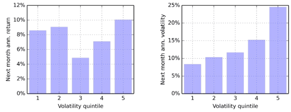
How to read it. The months are split into five groups by the previous month's volatility. On the left the average return of the next month, on the right its volatility, both annualized.
What to notice. On the right a staircase: roughly 8, 10, 12, 15 and 25 %. On the left there is no order: roughly 8.5, 9, 5, 7 and 10 %. Risk is predictable, reward is not, so scaling can raise the Sharpe ratio.
A small slip in the caption. The caption of Figures 2 and 6 says
"when sorting on the previous month’s return", while the text sorts by the previous month's volatility; judging by the figure's axes, the second is correct.
Table 3 of the paper, US equities 1927–2017.
| Scaling | Sharpe before costs | Sharpe after | Average position | Turnover | Vol of vol | Worst 1 % | Worst 5 % | Best 5 % | Best 1 % |
|---|---|---|---|---|---|---|---|---|---|
| Unscaled | 0.40 | 0.40 | 52 % | 0.00 | 4.6 % | −11.4 % | −6.9 % | 6.3 % | 11.8 % |
| Half-life 10 days | 0.48 | 0.48 | 71 % | 4.66 | 1.7 % | −8.3 % | −6.1 % | 5.8 % | 7.3 % |
| Half-life 20 days | 0.49 | 0.49 | 70 % | 2.39 | 1.8 % | −9.0 % | −6.4 % | 5.8 % | 7.3 % |
| Half-life 40 days | 0.50 | 0.50 | 69 % | 1.22 | 1.9 % | −9.6 % | −6.5 % | 5.8 % | 7.4 % |
| Half-life 60 days | 0.51 | 0.51 | 68 % | 0.82 | 2.1 % | −9.9 % | −6.6 % | 5.9 % | 7.5 % |
| Half-life 90 days | 0.51 | 0.51 | 67 % | 0.56 | 2.2 % | −10.1 % | −6.7 % | 5.9 % | 7.7 % |
How to read this table. The Sharpe ratio rises from 0.40 to 0.48–0.51 and depends little on the estimation speed. The authors test significance with a regression of scaled daily returns on unscaled ones: the intercept is 0.64 bp a day, t-statistic 3.05 with a Newey–West correction for 30 lags (footnote 15). Vol of vol falls by a factor of two to three. The left tail improves most with the fastest estimate. The average position is higher (about 70 % against 52 %): the scaled version adds risk in calm periods. Choosing the half-life is mainly choosing turnover: from 4.66 to 0.56 turns a year.
What is easy to miss. The right tail is cut too, and in the best 1 % of months even more than the left one: the best months go from 11.8 to 7.3 %, the worst from −11.4 to −8.3 %. The authors write plainly that scaling trims both tails. According to Appendix A, kurtosis falls noticeably, while the effect on skewness is ambiguous:
"The effect on skewness is more ambiguous"(section 2.3).
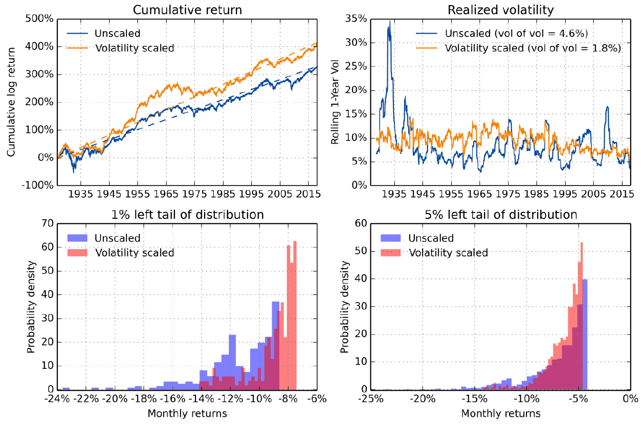
How to read it. Top left the cumulative return on a log scale, top right the rolling annual volatility of monthly returns, bottom the histograms of the worst 1 % and 5 % of months. Blue is unscaled, orange or red is scaled, half-life 20 days.
What to notice. Top right, the unscaled line goes above 30 % in the 1930s and drops to 5 %, while the scaled one stays around 10 % almost all the time; the legend shows vol of vol of 4.6 % against 1.8 %. Top left, the scaled version is ahead except in the middle of the sample. At the bottom, months worse than −10 % are more frequent without scaling.
The practical takeaway. Scaling first of all keeps the promise on the level of risk, and only then makes money.
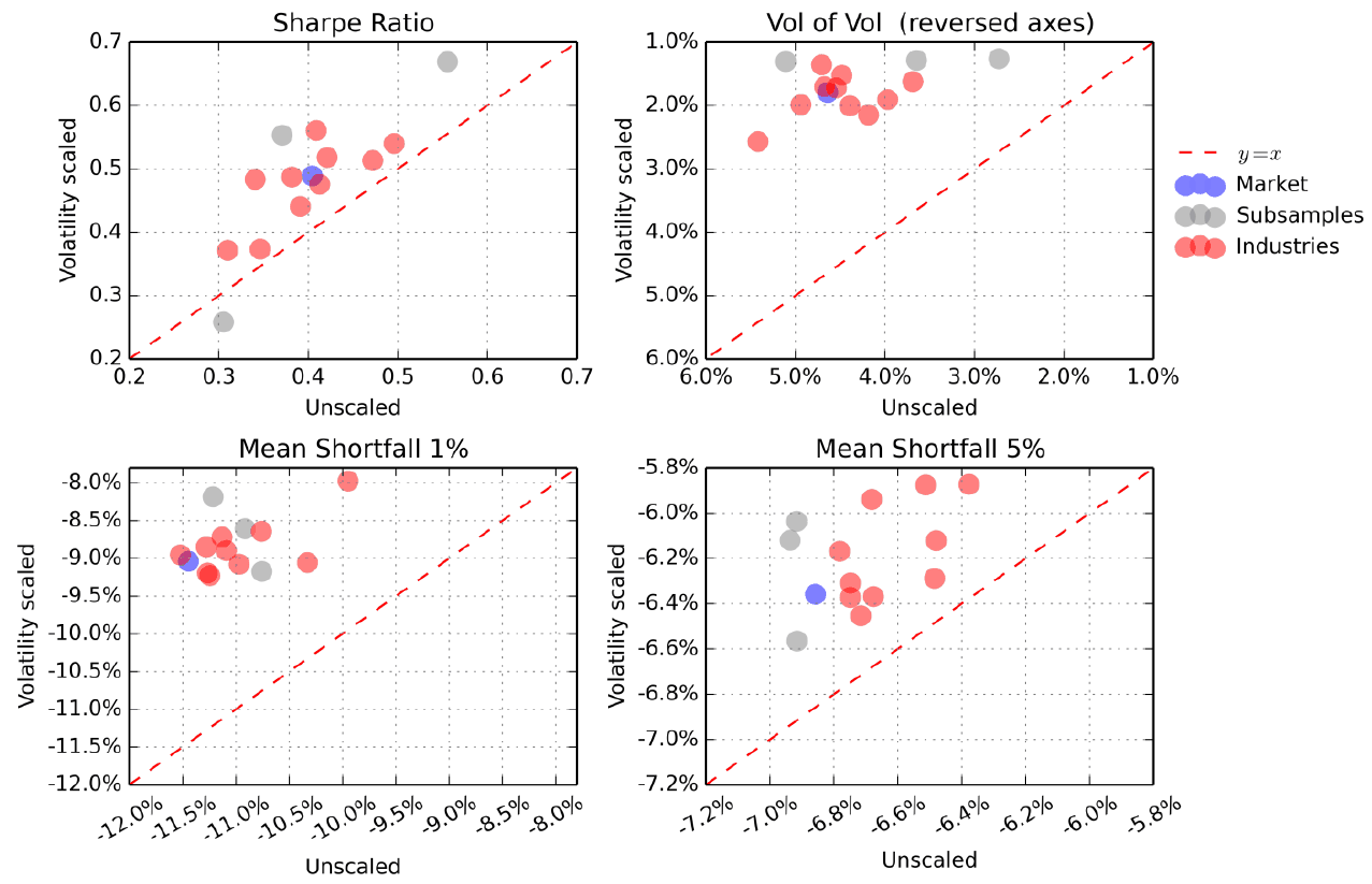
How to read it. Four scatter plots. Horizontally the metric without scaling, vertically with it. A point above the dashed diagonal means an improvement (for vol of vol the axes are flipped so that the rule is the same). The blue point is the whole market, the gray ones the three thirty-year periods, the red ones the 10 industries.
What to notice. According to the authors,
"The Sharpe ratio improves in all cases, except during the 1957-1987 subsample period"(section 2.4): one gray point lies below the diagonal. Vol of vol and both tails improve for all points.
Intraday data (Table 4 of the paper, S&P 500, 1988–2017). Without scaling the Sharpe ratio is 0.50, vol of vol 3.8 %. With the daily estimate 0.57–0.60, with the 5-minute one 0.60–0.63 at comparable turnover; vol of vol and the left tail are also slightly better. The authors call the improvement small.
4. Bonds and credit
US bonds. Returns are reconstructed from daily returns of ten-year par bonds since 1962. The authors warn about structural shifts: before 1980 bonds were much calmer, before 1967 calmer still, and the excess return over the first 55 years was flat, with a forty-year drawdown that ended in the 1980s.
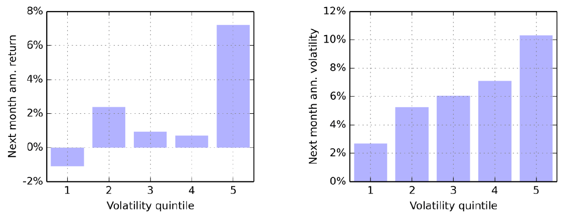
How to read it. The same analysis as in Figure 2.
What to notice. On the right, again a staircase from 2.7 to 10.3 %. But on the left there is an order: in the calmest group the return is negative, about −1 %, in the most turbulent about 7 %. For bonds, predictably high risk was paid more, and cutting the position in turbulent months is not obviously profitable.
Table 5 of the paper, US bonds 1963–2017.
| Scaling | Sharpe before costs | Average position | Turnover | Vol of vol | Worst 1 % | Worst 5 % | Best 1 % |
|---|---|---|---|---|---|---|---|
| Unscaled | 0.25 | 127 % | 0.00 | 3.9 % | −8.4 % | −5.9 % | 11.7 % |
| Half-life 10 days | 0.05 | 180 % | 4.96 | 2.1 % | −8.6 % | −6.3 % | 8.2 % |
| Half-life 20 days | 0.06 | 179 % | 2.51 | 2.1 % | −8.9 % | −6.3 % | 8.4 % |
| Half-life 40 days | 0.08 | 177 % | 1.27 | 2.2 % | −9.0 % | −6.4 % | 8.5 % |
| Half-life 60 days | 0.08 | 174 % | 0.86 | 2.4 % | −9.2 % | −6.4 % | 8.5 % |
| Half-life 90 days | 0.09 | 170 % | 0.58 | 2.6 % | −9.5 % | −6.4 % | 8.6 % |
The Sharpe ratio falls from 0.25 to 0.05–0.09. The authors' explanation: the years 1960–1980 were both loss-making and quiet, and targeting held a large position through this long bear market. Vol of vol falls all the same. Note the tails: the worst months here do not improve but get slightly worse at every speed, from −8.4 to −8.6…−9.5 %.
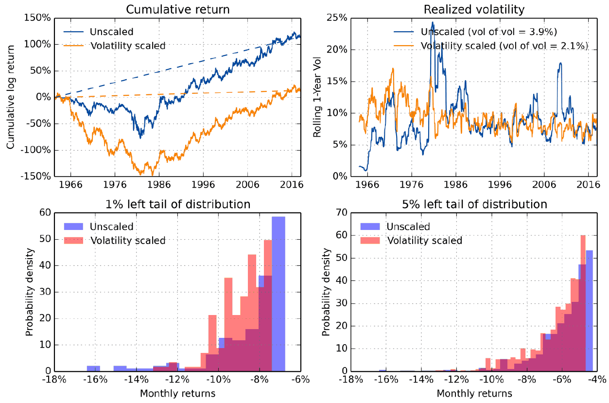
How to read it. The same four panels as in Figure 3.
What to notice. Top right, unscaled bonds have very low volatility in 1964–1980, hence the inflated positions of the scaled version. Top left, by the early 1980s the scaled version falls into a log drawdown of about −140 % against roughly −70 % unscaled, and then grows in parallel. According to the authors,
"The underperformance of the volatility scaled invesment is solely due to the pre-1980 period"(section 3.3; the typo is in the original).
Ten-year Treasury futures, 1988–2017 (Table 6 of the paper, Figure 8). The authors allow that the bond market changed structurally in the mid-1980s (monetary policy began to target inflation), and the modern sample is more representative. Here the Sharpe ratio is 0.64 unscaled and 0.63 with all daily estimates, up to 0.66 with the 5-minute one. Vol of vol falls from 2.5 to 1.2–1.6 %, while the worst months are almost the same (−7.3 % against −7.5 %): "the Sharpe ratio and mean shortfall (left tail) are similar" (section 3.4).
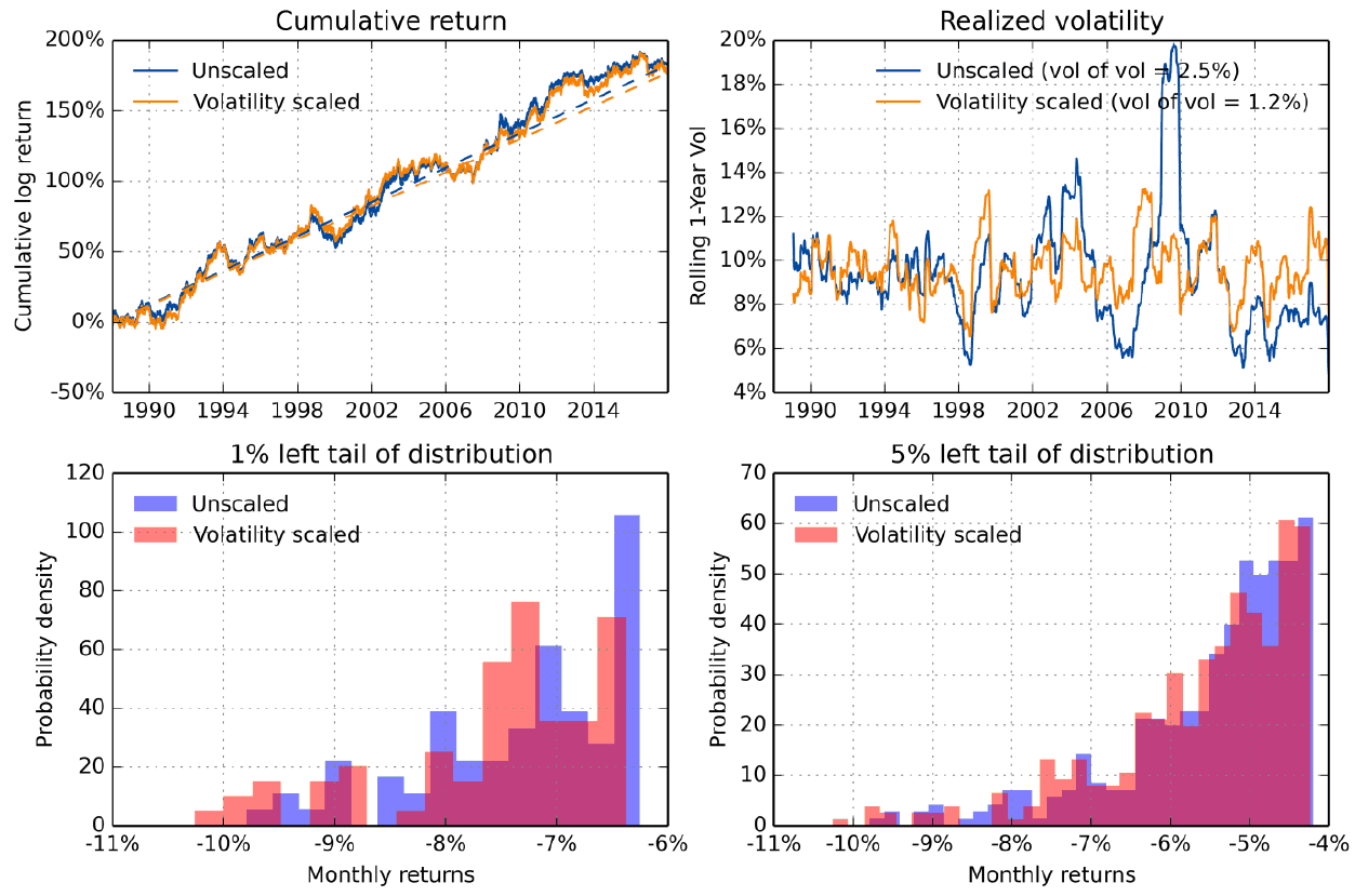
What to notice. The cumulative return curves almost coincide. The only difference is top right: the legend shows vol of vol of 2.5 % against 1.2 %.
Credit (Table 7 of the paper, 1988–2017). The BofA Merrill Lynch corporate bond index hedged with Treasuries, that is, close to the synthetic CDX index.
| Scaling | Sharpe before costs | Sharpe after | Average position | Turnover | Vol of vol | Worst 1 % | Worst 5 % |
|---|---|---|---|---|---|---|---|
| Unscaled | 0.30 | 0.30 | 273 % | 0.00 | 6.7 % | −14.5 % | −7.2 % |
| Half-life 10 days | 0.49 | 0.46 | 510 % | 4.79 | 4.1 % | −11.8 % | −7.1 % |
| Half-life 20 days | 0.41 | 0.39 | 486 % | 2.49 | 4.3 % | −13.3 % | −7.6 % |
| Half-life 40 days | 0.30 | 0.30 | 458 % | 1.30 | 4.6 % | −14.9 % | −8.0 % |
| Half-life 60 days | 0.24 | 0.23 | 439 % | 0.89 | 4.9 % | −15.7 % | −8.2 % |
| Half-life 90 days | 0.18 | 0.17 | 415 % | 0.61 | 5.2 % | −16.4 % | −8.4 % |
For credit, unlike equities, the result depends heavily on the estimation speed: a fast one raises the Sharpe ratio from 0.30 to 0.49, a slow one drops it to 0.18. The left tail, according to the authors, "is similar to unscaled for fast volatility estimates, but worse otherwise" (section 3.5). The average position is 273–510 %: credit is hedged with Treasuries and very quiet, and 10 % volatility takes many times leverage.
5. 50 futures and forwards
Man AHL data since 1988: 6 agricultural, 6 energy and 7 metal contracts, 9 currencies against the dollar, 10 equity indices, 9 bond and 3 interest rate contracts.
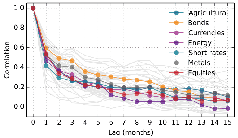
How to read it. Horizontally the lag in months, vertically the correlation of this month's variance with the variance of the month that many months away.
What to notice. All seven sectors are similar: about 0.5 at the first lag and 0.1–0.2 by the twelfth. Bonds are above the rest. Volatility clustering is present everywhere, and it is the foundation of targeting.
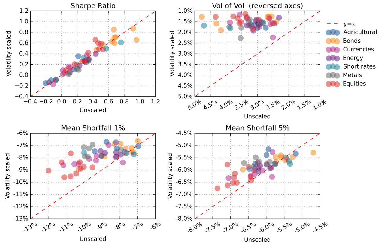
How to read it. The same four scatter plots as in Figure 4, with points colored by sector.
What to notice. On the Sharpe ratio the cloud lies along the diagonal: a small improvement for equity indices, and for the other sectors roughly as many points above as below. Vol of vol improves for all markets. On the worst 1 % and 5 % of months almost all points are above the diagonal, but a few lie on it or slightly below; the authors write of an improvement
"for almost all assets"(section 4.2).
6. Portfolios: 60/40 and risk parity
Three variants: no scaling at all; scaling only the individual assets; scaling the assets and then the whole portfolio. The second layer, according to the authors, essentially corrects for changing correlations between assets. The assets are first brought to 10 % volatility over the full sample, so the 60/40 and 25/25/25/25 weights here are risk weights, not capital weights. Rebalancing is daily, for simplicity.
Table 8 of the paper, 60/40 portfolio (S&P 500 and ten-year Treasuries), 1988–2017.
| Assets | Portfolio | Sharpe before | Sharpe after | Average position | Turnover | Vol of vol | Worst 1 % | Worst 5 % | Best 5 % | Best 1 % |
|---|---|---|---|---|---|---|---|---|---|---|
| unscaled | unscaled | 0.80 | 0.80 | 153 % | 0.00 | 3.4 % | −9.7 % | −6.0 % | 6.8 % | 9.7 % |
| 20 days | unscaled | 0.87 | 0.87 | 179 % | 2.24 | 2.2 % | −8.0 % | −5.6 % | 6.6 % | 8.7 % |
| 20 days | 20 days | 0.91 | 0.90 | 183 % | 3.95 | 1.3 % | −7.3 % | −5.5 % | 6.5 % | 8.0 % |
Table 9 of the paper, risk parity 25/25/25/25 (equities, bonds, credit, commodities), 1988–2017. The commodity part is split equally between gold, copper and oil.
| Assets | Portfolio | Sharpe before | Sharpe after | Average position | Turnover | Vol of vol | Worst 1 % | Worst 5 % | Best 5 % | Best 1 % |
|---|---|---|---|---|---|---|---|---|---|---|
| unscaled | unscaled | 0.80 | 0.80 | 268 % | 0.00 | 4.3 % | −12.8 % | −6.1 % | 6.5 % | 9.4 % |
| 20 days | unscaled | 0.89 | 0.88 | 412 % | 2.39 | 1.7 % | −8.8 % | −6.0 % | 5.9 % | 7.0 % |
| 20 days | 20 days | 0.91 | 0.89 | 402 % | 3.95 | 1.7 % | −8.2 % | −5.7 % | 6.2 % | 7.9 % |
How to read both tables. Most of the improvement comes from the first layer. For 60/40 the second layer adds 0.04 to the Sharpe ratio and lowers vol of vol from 2.2 to 1.3 %, but almost doubles turnover (2.24 → 3.95). For risk parity the second layer adds nothing on vol of vol (1.7 and 1.7 %). For 60/40 the improvement in the left tail is larger than the loss in the right one: the worst 1 % by 2.4 pp, the best 1 % by 1.7 pp.
Maximum drawdown (Appendix A). For 60/40 from −28.1 to −22.2 %, for risk parity from −42.1 to −32.1 %, for US equities from −60.9 to −42.8 %. The authors themselves note that drawdown
"is not our preferred risk metric"(Appendix A): it is built from a single realized path.
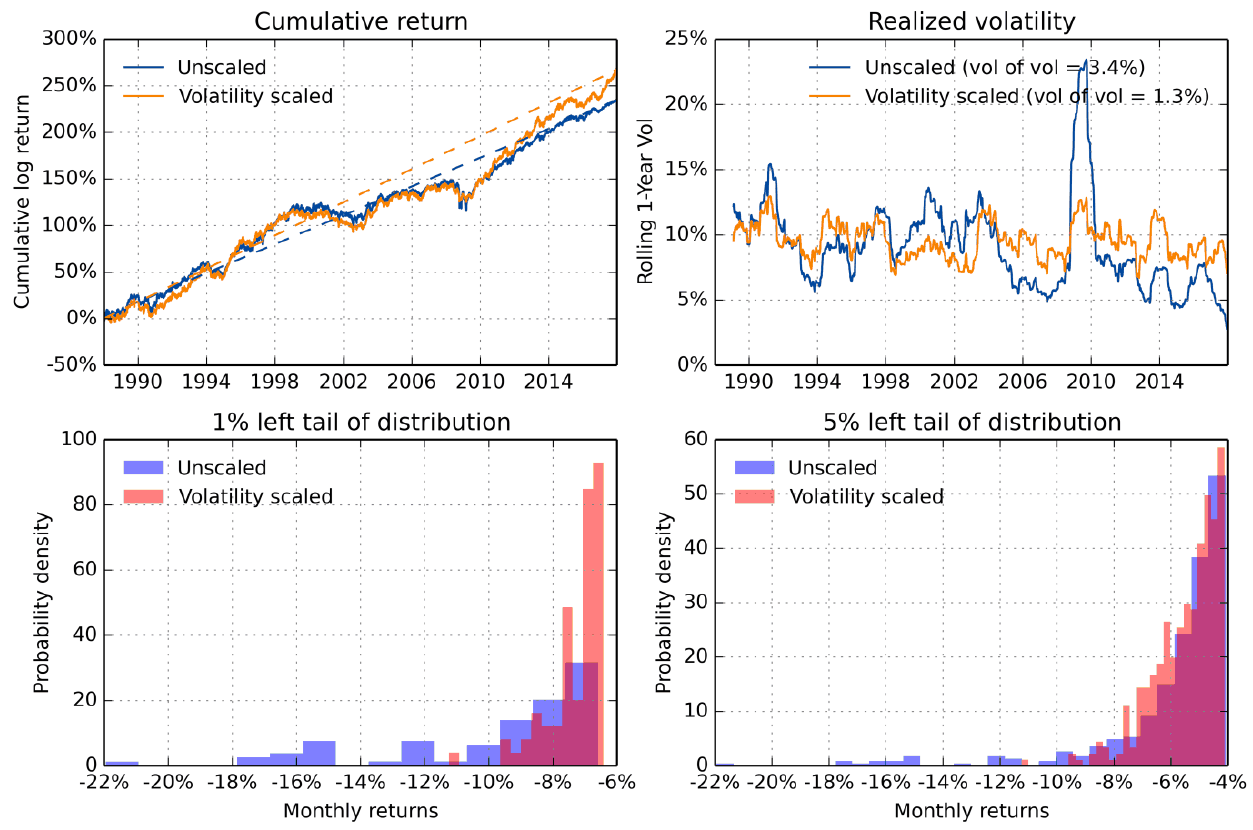
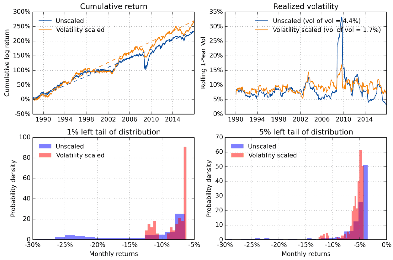
How to read Figures 11 and 12. The main panel is the top right one. Without scaling, volatility in 2008–2009 jumps to 23–33 %; with scaling it stays around 10 %. At the bottom, the unscaled version has individual months down to −20 % and worse, while the scaled version's worst months cluster around −10 %.
7. Why the Sharpe ratio rises only for risky assets
The authors' explanation comes in three steps.
Step 1. The leverage effect exists only for risky assets. It is the tendency of returns to be negatively correlated with changes in volatility. The classic explanation is Black's (1976): when stocks fall, the ratio of the firm's value to the value of its equity rises, that is, its debt load, and equity volatility should rise. The authors also mention the reverse version (volatility feedback): a rise in volatility raises the required premium and thereby knocks down the price.
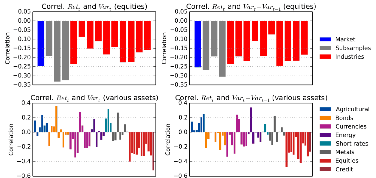
How to read it. Each bar is the correlation of an asset's monthly return with that month's variance (left) or with its change (right). At the top US equities: the market, three subperiods, 10 industries. At the bottom credit and 50 markets colored by sector.
What to notice. For equities all bars are negative, for the market about −0.25. At the bottom, equity indices and credit are clearly negative (down to −0.5). For bonds, currencies, commodities and rates the bars are on both sides of zero.
Step 2. The leverage effect turns scaling into hidden momentum. If volatility is higher after a fall, the position after a fall is smaller; after a rise, larger. This is the behavior of a trend strategy, arising without a trend signal.
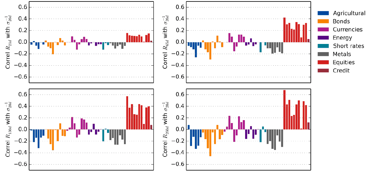
How to read it. Four panels for the past return over 1, 3, 6 and 12 months. Each bar is the correlation of that return with , that is, with the position size under scaling.
What to notice. For equity indices and credit the correlation is positive at all horizons and grows with the horizon, up to 0.4–0.6 at 6–12 months. For the other sectors it is, according to the authors,
"predominantly negative"(section 6.2): scaling adds a mean reversion bet. This is especially visible for agricultural commodities, metals and bonds at long horizons.
Step 3. The measure of hidden momentum explains the spread in Sharpe gains.
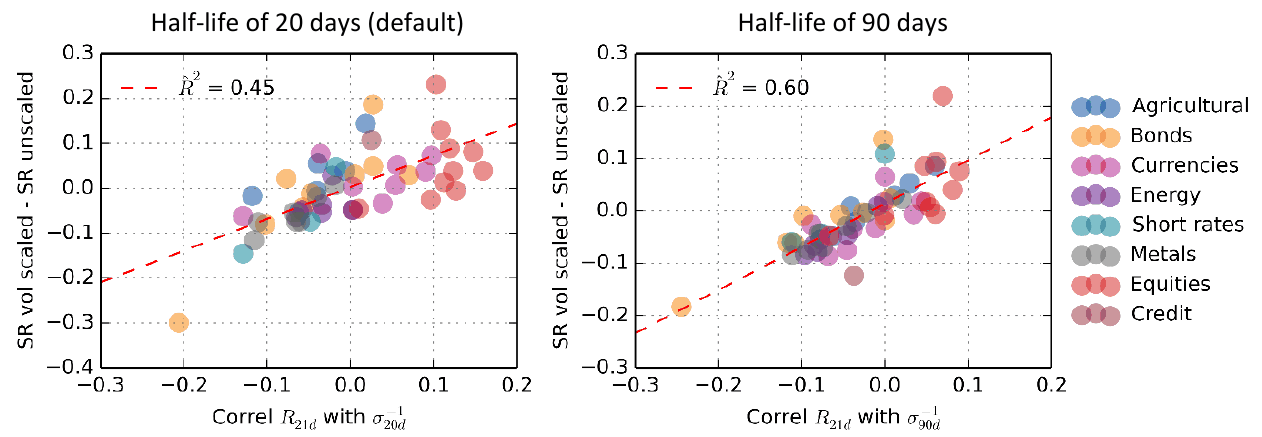
How to read it. Each point is one asset. Horizontally the correlation of the past 21-day return with , vertically the Sharpe gain from scaling. On the left half-life 20 days, on the right 90.
What to notice. The cloud stretches from bottom left to top right: the more “momentum-like” the scaling, the larger the Sharpe gain. is 0.45 and 0.60. Top right are equity indices, bottom left bonds and commodities.
What else is visible. On both panels one bond point lies far to the bottom left (about −0.2…−0.25 horizontally and −0.3 or −0.18 vertically). Such extreme points noticeably affect in a sample of about fifty markets; the paper has no check without it. This is our observation from the figure.
What this is. The share of the cross-asset spread in Sharpe gains that the line in Figure 15 explains.
What each symbol means. : the Sharpe gain for asset . (“y hat”): the value on the line at its “momentum-likeness”. (“y bar”): the average gain across all assets.
Step by step. Add up the squared deviations of the points from the line, divide by the sum of squared deviations from the mean, subtract from one.
A worked example on the paper's numbers. means that 45 % of the spread in Sharpe gains coincides with how much momentum the scaling adds; the remaining 55 % is not explained by it.
Why this matters. This is the paper's main argument: the Sharpe gain from volatility targeting is to a large extent explained by hidden momentum. Hence a corollary that the authors state cautiously and we state more directly: if the portfolio already contains a trend strategy, one should not expect the full Sharpe gain from targeting. In the conclusion the authors themselves suggest a trend overlay as another way to improve a long portfolio.
8. What is shaky in the paper
Caveats the authors make themselves
US only. The detailed analysis of equities and bonds is done on the US: "the US is an ex-post winner" (conclusion), a century of growth and not a single major war on its own territory. For bonds this is especially important: when a government's solvency is in question, government debt starts to behave like credit, and the authors themselves suggest reading the conclusion that bonds gain nothing with this caveat.
Costs. Post-crisis estimates are applied to the whole history since 1926, which for the early decades, according to the authors, is "not necessarily representative of trading cost further back in time" (footnote 13). Rolls of futures and forwards are not accounted for. Portfolios are rebalanced daily for simplicity.
Structural shift in bonds. The poor result for bonds in 1963–2017 is created entirely by the period before 1980, and the authors themselves consider the sample after 1988 more representative.
Drawdown. The authors show maximum drawdown in the appendix but do not consider it a reliable metric.
Intraday data. According to the authors, they have only “scratched the surface” of the topic.
What is visible on reading but not discussed in the paper
These are our observations from the paper's tables and figures, not a recomputation of its numbers.
The left tail does not improve everywhere. The abstract says that targeting "reduces the likelihood of extreme returns, across all asset classes" (abstract). For vol of vol this is visible in all tables, for kurtosis in the figures of Appendix A. But the average loss of the worst 1 % of months in the paper's own tables gets worse for bonds in 1963–2017 at every speed (−8.4 → −8.6…−9.5 %), barely changes for Treasuries since 1988 (−7.3 → −7.5 %), and gets worse for credit at half-lives from 40 days (down to −16.4 %). The text of sections 3.3–3.5 describes this honestly, but the conclusions sound like a general rule. The tail improves robustly for equities and for portfolios with a large share of them.
For equities the right tail is cut more than the left. In Table 3 the best 1 % of months loses 4.5 pp (11.8 → 7.3 %), the worst 1 % gains 3.1 pp (−11.4 → −8.3 %). The statement that the improvement in the left tail exceeds the loss in the right refers in the paper to the 60/40 portfolio, not to equities.
The of the mechanism rests on about fifty points with outliers. See Figure 15: there is no formal robustness check of the regression and no intervals for .
Significance is reported only for equities. The regression with an intercept and a t-statistic of 3.05 is given for US equities; for the 60/40 and risk parity portfolios, where the Sharpe ratio rises 0.80 → 0.91 over 30 years, there is no test.
Conflict of interest. Five of the six authors work at Man Group, and Harvey is its adviser; the company manages risk-targeted and trend strategies. The affiliation is disclosed in footnote 1, and the paper's conclusion itself is, if anything, neutral for such products: it limits the promise of a Sharpe gain to risky assets.
9. What follows in practice
Separate the two promises of volatility targeting. “Stabilize risk” holds for all asset classes. “Raise the Sharpe ratio” holds for equities and credit, and, by the authors' explanation, mostly through hidden momentum. For planning and for a conversation with an investor these are two different arguments with different reliability.
Vol of vol as an acceptance metric. If a strategy promises a level of risk, what needs checking is the spread of annual volatility around the target, not the average volatility over the whole history. In the paper this metric falls by a factor of two to three in all cases.
Check the sign of the hidden bet on your own instruments. The correlation of with the past return shows what exactly scaling will add: a positive one adds momentum, a negative one a mean reversion bet. For markets outside the paper's sample, cryptocurrencies for example, the sign is not known in advance.
A quiet bear market is targeting's main enemy. Bonds in the 1960s–1970s: losses at low volatility, and the mechanism holds the maximum position in such a market. Such periods are worth looking for in your instruments' history in advance.
The half-life is chosen by turnover, not by the Sharpe ratio. For equities the Sharpe ratio barely changes between 10 and 90 days (0.48 and 0.51), while turnover differs eightfold (4.66 and 0.56). For credit it is the opposite: the Sharpe ratio depends heavily on the speed. So the grid of speeds has to be run for each class separately.
The second layer of scaling costs its own turnover. For 60/40 it gives +0.04 to the Sharpe ratio and noticeably lowers vol of vol, but almost doubles turnover; for risk parity it adds nothing on vol of vol.
Do not expect a tail improvement where there is no leverage effect. For bonds and for slowly scaled credit the worst months did not improve in the paper.
10. Testable ideas
| No. | Idea | Type | Where to compute |
|---|---|---|---|
| 1 | For each instrument, before introducing targeting, sort the months by the previous month's volatility and compare the return and volatility of the next month; if the return rises together with past volatility, as for bonds in Figure 6, introduce it only for the sake of risk stability | diagnostic | Python |
| 2 | Compute vol of vol (the standard deviation of rolling annual volatility) and publish it next to the Sharpe ratio in every report of a strategy with a risk target | acceptance metric | any |
| 3 | Compute the correlation of with the past return over 1, 3, 6 and 12 months for each instrument: the sign shows whether scaling will add momentum or a reversion bet | diagnostic | Python |
| 4 | If the correlation from idea 3 is positive and the portfolio already contains a trend strategy, measure the Sharpe gain from targeting after controlling for your own trend basket | audit | Python |
| 5 | Implement scaling at the asset level and at the portfolio level as two independent multipliers and report the contribution of each to the Sharpe ratio, vol of vol, the worst 1 % of months and turnover | design change | backtester |
| 6 | Run half-lives of 10, 20, 40, 60 and 90 days and build a “turnover against Sharpe” table separately by asset class; choose by costs, and for classes where the Sharpe ratio depends on speed, as for credit, do not tune the speed by the Sharpe ratio | diagnostic | backtester |
| 7 | For instruments with minute data, estimate volatility from 5-minute returns during liquid hours and compare with the daily estimate at comparable turnover | design change | Python |
| 8 | Find periods of simultaneously negative return and low volatility in each instrument's history and look at what targeting did in them | audit | Python |
| 9 | Report the average result of the worst 1 % and 5 % of months and of months above the 95th and 99th percentiles instead of VaR, to see how much of the right tail was given up for the left | acceptance metric | Python |
| 10 | Check the left-tail improvement for each asset class separately rather than carrying it over from equities: in the paper the worst months got worse for bonds and for slowly scaled credit | audit | Python |
| 11 | Repeat the regression “Sharpe gain on the momentum-likeness of scaling” on your own markets, dropping extreme points one at a time, and report the spread of | audit | Python |