How to read this walk-through. The paper tests three details of a futures trend strategy: how to measure volatility, when to open a position, and how to account for markets moving together. The main conclusions are collected in the section “The main thesis” and in the tables of sections 3–6. The formulas are taken apart symbol by symbol and on numbers, but they can be skipped: each callout starts by saying in words what it is. We did not recompute the paper's numbers; examples on numbers the authors do not give are marked as ours.
The main thesis
In the academic literature a futures trend strategy is usually assembled the same way, following Moskowitz, Ooi and Pedersen (2012). The volatility of each market is computed as the standard deviation of daily close-to-close returns. The direction of the position is taken from the sign of the 12-month return. The position size is made inversely proportional to volatility, and correlations between markets are ignored altogether.
Baltas and Kosowski replace each of the three components with a theoretically better one and watch what happens to turnover and to the Sharpe ratio before and after costs. The three replacements end differently.
A volatility estimate from OHLC (the Yang–Zhang estimator) cuts turnover by about a tenth and leaves the Sharpe ratio unchanged.
A trend significance rule (TREND: long or short only when the slope t-statistic is beyond ±2, otherwise out of the market) cuts turnover by a factor of three with a statistically indistinguishable Sharpe ratio.
Adjusting leverage for the average pairwise correlation raises turnover by half, but improves the tail of the distribution and doubles the Sharpe ratio in the post-crisis years 2009–2013.
The conclusion that is awkward for the authors themselves is in the section on costs: under a linear cost model the turnover reduction hardly turns into a higher Sharpe ratio. They write that the result came out "Contrary to expectations and based on this model" (introduction), and explain it by the simplicity of the cost model.
1. How the data and the futures return are built
The sample: 75 futures, daily open, high, low, close, December 1974 – February 2013. Of these, 26 are commodities, 23 equity indices, 7 currencies and 19 bond and interest rate contracts. The data are from Tick Data; for equity indices, before the future existed, the history is extended with spot prices from Datastream. Contracts start at different times: on average an asset has 319 months, and before 1983 the sample has fewer than 20 markets, and the authors ask that correlation estimates on this stretch be read with care: "should be treated with caution" (section 5.1). Seven contracts end before February 2013, and EUR/USD before 1999 is stitched to the German mark.
Stitching contracts. The most liquid contract is traded, usually the front one; a few days or weeks before delivery the position moves to the second one. At each roll the entire past history is multiplied by the ratio of the new and old contract prices (backwards ratio adjustment).
Why this matters. A future lives a few months. To get a series like “crude oil since 1987”, short contracts are stitched into one. On the switch day the old contract is priced at, say, 100 and the new one at 103. If the series are simply joined, a jump of +3 appears that nobody earned. One can subtract 3 from the entire past history (difference adjustment) or multiply it by 1.03 (proportional adjustment). The authors choose the second: difference adjustment distorts percentage changes and, in their words, biases the average return for markets that are on average in backwardation or contango. Proportional adjustment only rescales the series and leaves percentages alone. The numbers 100 and 103 are our example.
The futures return. The authors first write out the return including margin and then adopt the assumption of full collateralization:
What this is. The return of a future as if its full value, not only the margin, were set aside for the contract.
What each symbol means. (“F t, capital T”): the futures price at the end of month for the contract that expires at time . : the price of the same contract a month later. : the return over that month.
Step by step. Subtract the old price from the new one, divide by the old one.
Our example. A contract was priced at 80,000 and rose to 82,000. The return is . If we divided by the margin of 5,000, we would get 40 %, and the leverage would hide inside the number.
Why this matters. Under full collateralization a future is computed like an ordinary stock, and leverage appears as a separate multiplier when the position size is chosen. The authors note that this excess return has the same form as the total return of a spot stock purchase.
Descriptive statistics (Table I of the paper): 67 of the 75 contracts have a positive mean excess return, significant at the 10 percent level for 29. For currencies and commodities the means are mostly insignificant. Fat tails for all but four, and equity futures almost always have negative skewness. The spread of volatilities is huge: natural gas about 61 % a year, three-month Euribor about 0.7 %. This spread is exactly the reason to weight markets inversely to volatility.
2. The method in one line
Each market gets a direction from the trading rule and a size inverse to its volatility; the portfolio is the average of these positions. Turnover in such a strategy arises for two independent reasons: the volatility estimate changes and the signal changes. The paper fixes each reason separately and adds a third multiplier for correlations.
What this is. The whole strategy in one line: for each market, the direction times the size times what the market did over the following month; then the average over markets.
What each symbol means.
- (“sum”): add up over all markets from the first to the -th; divides by their number, so this is an ordinary average.
- : how many markets are available in month ; in 1975 there were few, by 2013 there were 75.
- : the trading rule for market , long, short, and for the TREND rule also .
- (“sigma target”): the desired volatility of one position, 40 % a year for the authors.
- (“sigma”): the volatility estimate of market at the end of month .
- : the market's return over the following month, the only quantity unknown at the time of the decision.
Step by step. For each market: determine the direction, divide 40 % by its volatility, multiply direction, size and return. Add up over markets, divide by their number.
Our example. Three markets. Crude oil: long, volatility 30 %, size , the market returned +5 %, contribution +6.7 %. Gold: short, 15 %, size 2.67, the market +2 %, contribution −5.3 %. Bonds: long, 5 %, size 8, the market +0.5 %, contribution +4.0 %. The average is for the month.
Why this matters. Without dividing by volatility, a portfolio of 75 markets would be a portfolio of the jumpiest commodities. The target of 40 % per position is taken from Moskowitz and coauthors: the portfolio then comes out with a volatility of about 12 % a year, like the standard academic factors.
The authors note that a single position sized is already a constant volatility strategy (CVOL), and the trend strategy differs from it only by the multiplier . So they test all conclusions about turnover on both.
Two turnover channels. The first channel: the signal did not change, but the volatility estimate did, and the position size has to be adjusted.
What this is. How much one has to trade only because volatility changed.
What each symbol means. : “proportional to”. Vertical bars: absolute value, take the number without its sign, because one pays both for adding and for cutting. : inverse volatility, that is, the position size.
Our example. Volatility rose from 30 to 35 %: the size changes from 3.33 to 2.86, by 0.47. Volatility rose from 1.0 to 1.5 %: the size changes from 100 to 66.7, by 33.3, seventy times more.
Why this matters. Turnover depends on the change in the inverse quantity, so the quietest markets (rates, short bonds) produce disproportionately many rebalances. The authors add that volatility is not observed but estimated with error: . The noisier the estimate, the more unnecessary trades. Hence their first hypothesis: a more efficient estimator reduces turnover.
The second channel: volatility is the same, but the signal reversed.
What this is. How much one has to trade because of a change in direction.
What each symbol means. (“delta X”): how much the rule changed over the month. For the sign rule only two cases are possible: nothing changed, , or a reversal from to , .
Our example. A reversal in a market with 5 % volatility gives turnover proportional to ; the same reversal in a market with 40 % volatility gives .
Why this matters. In a “swamp” where the price hovers around zero, the sign rule flips from a full long to a full short. The authors' second hypothesis: a rule that does not switch in the absence of a strong trend will reduce this channel.
3. Volatility estimation: Yang–Zhang instead of closes
The usual estimate takes only closing prices and throws away everything that happened during the day. The authors cite 9 August 2011: intraday the FTSE 100 was down 5.48 % and up 2.10 % from the open, yet closed only 1.89 % higher. By closes the day looks calm. Estimators based on the daily range (range estimators) see such days. Of these the authors take Yang–Zhang: in their words, the most efficient one and the only one that depends neither on the overnight gap nor on price drift. They ran the others too (Parkinson, Garman–Klass, Rogers–Satchell), but do not report the results.
What this is. The final variance is assembled from three parts.
What each symbol means.
- (“sigma squared”): variance, the square of volatility. Variances are easier to add; the square root is taken at the end.
- : the overnight gap (overnight jump), the spread of returns from yesterday's close to today's open.
- : the usual close-to-close estimate.
- : the Rogers–Satchell estimator based on the intraday range.
- : the weight that splits the second and third parts; and add up to one.
Our example. , the overnight part 0.0001, close-to-close 0.0004, range 0.0002. The sum is , volatility a day.
What this is. The weight chosen by the estimator's creators so that the spread of the estimate itself is minimal. It depends only on the window length.
What each symbol means. : the number of days in the estimation window.
Our example. With the fraction is , and .
What this is. The Rogers–Satchell variance estimate for one day. The monthly estimate is the average of these daily ones.
What each symbol means. (“tau”): one day. , , : the log deviations of the high, low and close from the open of the same day.
Step by step, our example. Open 100, high 103, low 98, close 101: roughly , , . Then , the day's volatility is about 3.5 %. By the close the day would look like a 1 % rise.
Why this matters. If the day rose steadily from the open to the high and closed there, the first term is zero: that is movement, not churn. The estimator penalizes thrashing within the day.
According to the authors, Yang–Zhang is times more efficient than the usual estimate. The maximum is reached on a two-day window (almost 14 times); on a monthly window of 21 observations the gain is 8.2 times. “8.2 times more efficient” means that for the same precision the usual estimate needs roughly 8 times more data.
The result (Table II of the paper, 1-month estimation window). The last column, PF (perfect forecast), is an unattainable benchmark: the position size is computed from the actual volatility of the following month.
| CVOL, closes | CVOL, YZ | CVOL, PF | TSMOM, closes | TSMOM, YZ | TSMOM, PF | |
|---|---|---|---|---|---|---|
| Mean return, % | 12.69 | 12.55 | 14.69 | 14.95 | 14.72 | 17.33 |
| Volatility, % | 20.98 | 21.08 | 16.50 | 17.96 | 17.91 | 13.34 |
| Skewness | −0.30 | −0.36 | −0.41 | −2.38 | −2.31 | −0.03 |
| Kurtosis | 6.49 | 6.81 | 3.55 | 27.88 | 26.79 | 3.02 |
| Sharpe | 0.61 | 0.60 | 0.89 | 0.83 | 0.82 | 1.30 |
| Monthly turnover, % | 30.63 | 26.61 | 29.44 | 46.51 | 42.79 | 45.52 |
| Change in turnover vs closes | 0 | −13.10 % | −3.87 % | 0 | −8.00 % | −2.13 % |
The Sharpe ratio does not change with the estimator; turnover does. The perfect forecast benchmark gives 1.30 against 0.82–0.83, and the Ledoit–Wolf test rejects equality of Sharpe ratios (p-values 0.08–0.10 %). The authors read this as follows: there is headroom in a better volatility forecast, but the forecasting task is such that "this task is beyond the scope of this paper" (section 4.1.1).
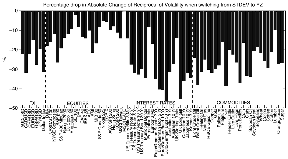
How to read it. Horizontally, all 75 contracts, grouped into currencies, equities, rates and commodities. Vertically, by how many percent the “Volatility Turnover” statistic, the mean absolute month-to-month change in , fell when switching to Yang–Zhang.
What to notice. All bars point down:
"Across all 75 contracts, without any exception"(section 4.1.1). The longest are in the interest rate block, where dividing by a small sigma is most sensitive. For equity indices the average drop is more than 10 %, for the S&P 500 about 26 %.The practical takeaway. Noise in the close-to-close volatility estimate is, by the authors' conclusion, the main cause of unnecessary rebalancing in constant volatility strategies.
Length of the estimation window. In Figures 2 and 3 of the paper the same strategy is run with a window from 1 to 12 months. The authors write that the Sharpe ratio of the trend strategy is highest with a three-month window, which agrees with the choice of Moskowitz and coauthors (exponential weights with a center of mass of 60 trading days). From then on the paper uses a 3-month window.
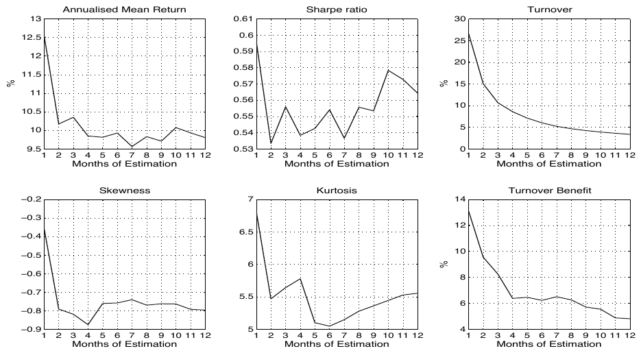
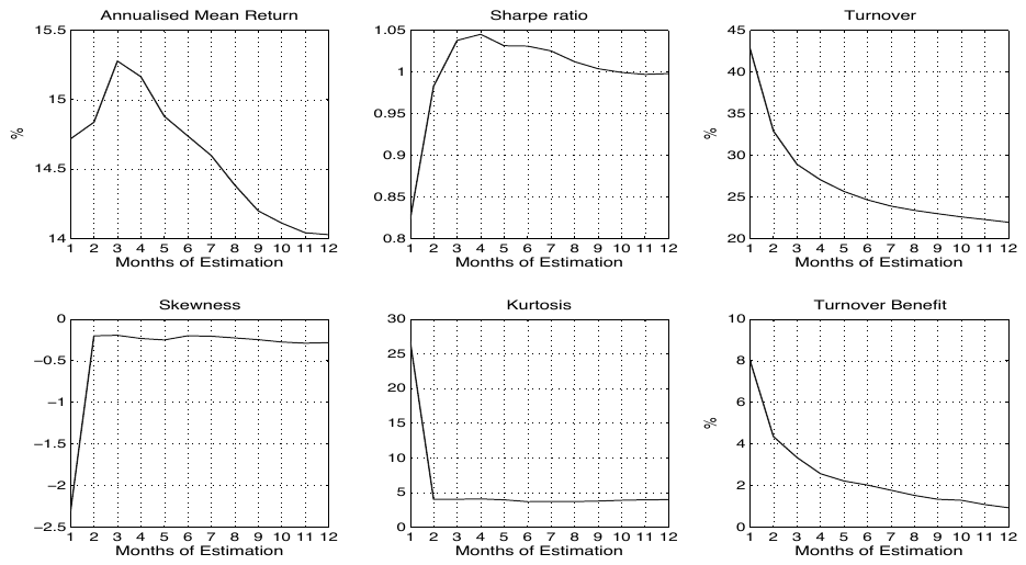
How to read Figures 2 and 3. Six panels, all with the window length in months on the horizontal axis. On top, mean return, Sharpe ratio, turnover; at the bottom, skewness, kurtosis and the turnover gain from Yang–Zhang.
What to notice. In Figure 3 the Sharpe ratio of the trend strategy rises from 0.83 with a one-month window to roughly 1.04 at three to four months and then slowly declines toward 1.0. Turnover falls as the window lengthens, from 43 to 22 % a month, and the gain from Yang–Zhang melts from 8 to 1 %: on a long window even a crude estimate has time to average out. In Figure 2, for the strategy without a trend, the Sharpe curve is jagged, from 0.53 to 0.60, and there is no maximum around three months.
What else is visible and easy to miss. The skewness of −2.3 and kurtosis of about 26 for the trend strategy occur only with a one-month window. Already at two months skewness is about −0.2 and kurtosis about 4. The heavy left tail in Table II is a property of the monthly estimation window, not of the trend strategy as such.
4. The trading rule: SIGN against TREND
What this is. The standard rule: if the 12-month return is nonnegative, otherwise .
What each symbol means. (“sign”): a function that cares only about the sign of a number. : the return from “12 months ago” to now.
The weak spot, our example. A rise of 40 % and a rise of 0.1 % give the same full long, while a rise of 0.1 % and a fall of 0.1 % give opposite positions.
What this is. A straight line is fitted through the logarithm of daily prices over the last year. If the slope is confidently positive, long; confidently negative, short; in all other cases there is no position.
What each symbol means.
- : the logarithm of the price on day (“tau”). The logarithm is needed so that the line means constant percentage growth.
- (“alpha”): the level of the line at the start, not used for the signal.
- (“beta”): the slope of the line, the key quantity.
- : the deviation of the price from the line on day .
- : the t-statistic of the slope, that is, the slope divided by its standard error. The authors compute the error with Newey–West, correcting for the strong dependence between neighboring daily prices.
Step by step. Fit a line through the prices over the year, divide the slope by its error, compare with the threshold of 2.
Our example. Two markets rose 8 % over the year. The first rose steadily, slope 8, error 2, : long. The second fell for half a year and bounced sharply, error 9, : out of the market. SIGN would give both the same long.
Why this matters. TREND has a third state, “out of the market”, which SIGN lacks. It stops flipping in a market without direction. The authors deliberately do not complicate the rule further: the aim is to
"avoid data mining"(footnote 10).
Predictability. Before comparing strategies, the authors check whether the past predicts the future with a panel regression across all 75 contracts:
What this is. Whether this month's return is related to the return months ago. In the second variant the right-hand side has the value of the SIGN or TREND rule instead of the past return.
What each symbol means. (“lambda”): the lag from 1 to 60 months. Dividing by puts quiet and turbulent markets on an equal footing. : the strength of the relationship at a given lag. (“epsilon”): what the relationship does not explain.
How the error is computed. Errors are clustered simultaneously by time and by asset: . The idea: all markets in a given month partly move together, and each market is related to itself over time. The authors cite Petersen (2009): clustering along “the wrong” axis understates errors and inflates t-statistics. On their data, clustering only by asset gives inflated t-statistics close to plain OLS.
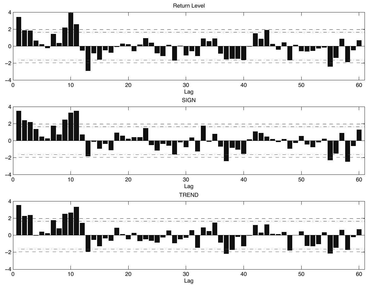
How to read it. Three panels: past return, past value of SIGN, past value of TREND. Horizontally the lag in months, vertically the t-statistic. According to the figure caption, the dashed lines show significance at the 5 and 10 percent levels.
What to notice. The first twelve lags are almost all positive, many above the dashed line: what rose over the last year keeps rising. At the 13th lag there is a sharp drop downward, a reversal. The TREND panel looks the same as SIGN, even though TREND is often zero. The authors conclude that momentum rests on statistically significant trends. They allow that part of the sharp transition after 12 months may be explained by commodity seasonality (footnote 12).
The result (Table III of the paper, Yang–Zhang, 3-month window).
| SIGN | TREND | |
|---|---|---|
| Mean return, % | 15.28 | 14.83 |
| Volatility, % | 14.74 | 14.96 |
| Skewness | −0.20 | −0.28 |
| Kurtosis | 3.99 | 3.86 |
| Sharpe | 1.04 | 0.99 |
| Ledoit–Wolf p-value, % | 53.31 | |
| Monthly turnover, % | 28.89 | 9.68 |
| Change in turnover | 0 | −66.49 % |
| Correlation of the two strategies | 0.92 |
What p = 53 % means. If there were no real difference between the Sharpe ratios, we would see a difference this large or larger in roughly every second case. The data are not enough even to claim that SIGN is better. A correlation of 0.92 means that this is almost the same strategy, except that one of them can sit out of the market.
In the authors' wording, TREND gives a similar Sharpe ratio but "only requires one third of the trading" (section 4.2.2).
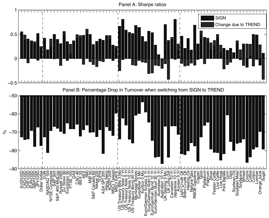
How to read it. Panel A: dark bars are the Sharpe ratio of a single SIGN strategy for each contract, light bars the change in the Sharpe ratio when switching to TREND. Panel B: the drop in turnover from the switch.
What to notice. Turnover drops everywhere, roughly from 55 to 85 %, for most contracts by about two thirds. The change in the Sharpe ratio is insignificant on average, but not uniform:
"The reductions appear to be concentrated among fixed income and commodities contracts"(section 4.2.2). In the figure, large negatives are visible for some of the interest rate contracts and for several commodities.
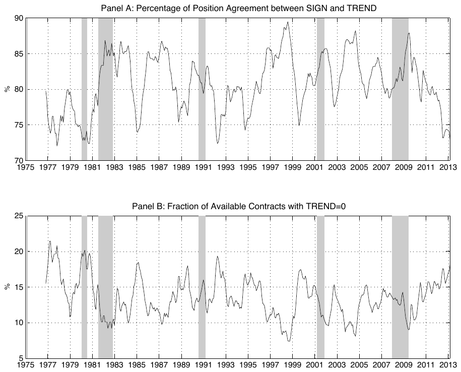
How to read it. Top panel: in what percentage of contracts both rules give the same direction, roughly from 72 to 89 %. Bottom panel: the share of available contracts where TREND is zero, that is, there is no significant trend. Gray bands are recessions.
What to notice. After 2008 the share of markets without a significant trend rises from about 9 % in early 2009 to 18 % in early 2013. This is the authors' first explanation of why trend strategies performed poorly after the crisis.
5. Correlations and the slump after 2008
If every position is set to the same volatility, the volatility of the portfolio depends on whether markets move together. The authors derive this explicitly.
What this is. The left formula: the volatility of a portfolio of positions with equal volatility. The right one: the average pairwise correlation.
What each symbol means.
- : portfolio volatility.
- (“rho”): the correlation of the pair of markets and , from −1 to +1.
- (“rho bar”): the average over all pairs.
- The double sum with goes through each pair once; there are pairs, hence the multiplier .
Our example. , 40 % per position. With the portfolio has . With it is already . With the full 40 %.
Why this matters. With the same positions, the portfolio's risk can differ several-fold purely because of correlations, and correlations change, especially in a crisis.
Inverting the formula gives the target volatility per position at which the portfolio holds a set level:
What this is. The correlation factor for leverage. The target volatility of one position becomes .
How it behaves, our example with . : . : . : . : .
Why this matters. When correlations rise, leverage is cut automatically, with no forecast and no view on the market. Instead of a covariance matrix, where 75 markets require estimating 2,775 pairs, a single number is estimated.
The final TSMOM-CF strategy:
What changed compared with section 2. Instead of a constant target per position there is a portfolio target , converted through the current average correlation. The signal and the averaging are the same. In the results table the average correlation is estimated over a 3-month window. The authors call the choice of 40 % per position and 12 % per portfolio immaterial:
"These choices of asset and portfolio target volatility are inconsequential"(section 5.2).
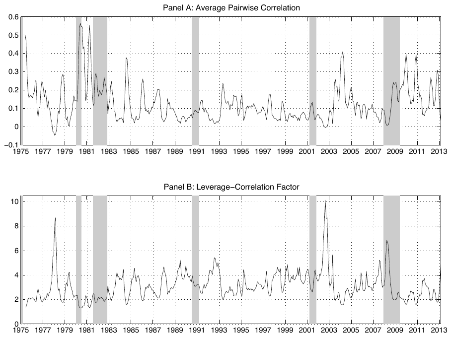
How to read it. Top panel: the average pairwise correlation over a 6-month window. Bottom panel: the multiplier . Gray bands are recessions.
What to notice. The panels mirror each other: correlation up, multiplier down. For most of the history the multiplier lies roughly between 2 and 5, with brief peaks up to 8–10 (around 1978 and in 2002–2003). From 2009 correlation rises to 0.3–0.4 several times, and the multiplier stays around 2.
Note. The figure uses a 6-month window, Table IV a 3-month window. Values before 1983 are built from fewer than 20 markets.
The result (Table IV of the paper).
| Full sample, no adjustment | Full sample, adjusted | 2009–2013, no adjustment | 2009–2013, adjusted | |
|---|---|---|---|---|
| Mean return, % | 15.28 | 15.98 | 2.00 | 3.52 |
| Volatility, % | 14.74 | 15.17 | 14.27 | 12.21 |
| Skewness | −0.20 | 0.32 | −0.07 | 0.64 |
| Kurtosis | 3.99 | 7.29 | 3.69 | 6.86 |
| Sharpe | 1.04 | 1.05 | 0.14 | 0.29 |
| Sortino | 1.81 | 1.98 | 0.20 | 0.46 |
| Calmar | 0.57 | 0.70 | 0.12 | 0.24 |
| Monthly turnover, % | 28.89 | 41.23 | 20.33 | 29.49 |
| Correlation of strategies | 0.94 | 0.96 |
How the three ratios differ. All three divide return by risk, but they understand risk differently. Sharpe divides by total volatility. Sortino only by downside volatility; upswings are not penalized. Calmar by the maximum drawdown.
How to read the table. Over the full sample the Sharpe ratio stands still, while Sortino, Calmar and the sign of skewness improve: the adjustment does not add return, it shifts fluctuations from the left tail to the right. In 2009–2013, when correlations were high, the gain shows up in the Sharpe ratio too. The price: turnover rises by about half.
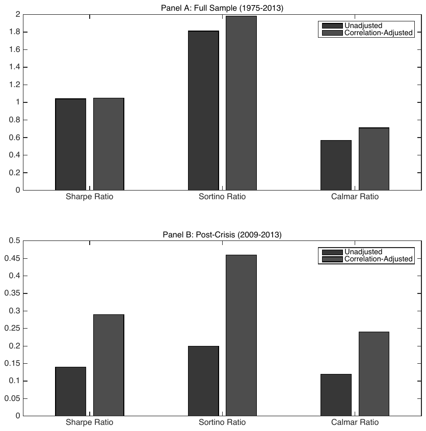
How to read it. Dark bars without adjustment, light bars with it. Panel A is the full sample, panel B January 2009 – February 2013.
What to notice. In panel A the pair of Sharpe bars is the same; Sortino and Calmar diverge. In panel B all three with the adjustment are roughly twice as high.
6. Costs
What this is. The cost model after Frazzini, Israel and Moskowitz: the amount lost to trading equals the amount traded times the price of a unit of trading.
What each symbol means. Turnover: turnover over the year. Market Impact: the average price shift from one's own trade, constant for the authors, 10 bp as a realistic scenario and 50 bp as a conservative one. A basis point is 0.01 %.
Where the simplification is. Impact is constant. The authors themselves call this an important limitation: in practice
"the market impact typically depends, among other things, on the order size"(introduction), and the dependence is usually convex. They ask that the results of this section be taken as an illustration:"intended to be illustrative"(section 6).
The result (Table V of the paper), annual costs and the Sharpe ratio after them.
| Strategy | Sharpe before costs | Costs at 10 bp, % a year | Sharpe at 10 bp | Costs at 50 bp, % a year | Sharpe at 50 bp |
|---|---|---|---|---|---|
| Constant volatility, closes | 0.61 | 0.37 | 0.59 | 1.84 | 0.52 |
| Constant volatility, YZ | 0.60 | 0.32 | 0.58 | 1.60 | 0.52 |
| TSMOM, closes | 0.83 | 0.56 | 0.80 | 2.79 | 0.68 |
| TSMOM, YZ | 0.82 | 0.51 | 0.79 | 2.57 | 0.68 |
| TSMOM, SIGN | 1.04 | 0.35 | 1.01 | 1.73 | 0.92 |
| TSMOM, TREND | 0.99 | 0.12 | 0.98 | 0.58 | 0.95 |
| TSMOM-CF, full sample | 1.05 | 0.49 | 1.02 | 2.47 | 0.89 |
| TSMOM without adjustment, 2009–2013 | 0.14 | 0.24 | 0.12 | 1.22 | 0.05 |
| TSMOM-CF, 2009–2013 | 0.29 | 0.35 | 0.26 | 1.77 | 0.14 |
Under the linear model, costs fall by roughly the same fraction as turnover: from Yang–Zhang by about 8–13 % (Tables II and V) and by about 66 % from TREND. Yet the Sharpe ratio after costs barely changes. At 10 bp TREND gives 0.98 against 1.01 for SIGN; it pulls ahead only at 50 bp (0.95 against 0.92). The authors call this surprising ("This finding appears surprising", section 6) and offer an explanation through the simplicity of the model. The correlation adjustment raises costs by 40–50 %, but in 2009–2013 its gain survives costs: 0.26 against 0.12 at 10 bp and 0.14 against 0.05 at 50 bp.
7. What is shaky in the paper
Caveats the authors make themselves
The cost model. The authors explicitly call the constant impact proportional to turnover an important limitation, and the after-cost results an illustration. All “after costs” conclusions are conditional on this assumption, including the main awkward conclusion that turnover savings do not turn into money.
The volatility forecast. The authors acknowledge the gap to the perfect forecast benchmark (Sharpe 1.30 against 0.82–0.83) and put it outside the scope of the paper.
Early correlations. Before 1983 the sample has fewer than 20 markets, and the authors ask that average correlation estimates on this stretch be read with care.
Simplicity of the rule. TREND is deliberately kept simple to guard against overfitting; the authors did not test more complex rules.
The improvement has a price. On the correlation adjustment: "does not come at no cost" (introduction); turnover rises from 28.89 to 41.23 % a month.
What is visible on reading but not discussed in the paper
These are our observations from the paper's own tables and figures, not a recomputation of its numbers.
The doubling of the Sharpe ratio after 2008 rests on a short stretch. Panel B of Table IV is January 2009 – February 2013, about 50 months. The Ledoit–Wolf test, which the authors report for Tables II and III, is not reported for Table IV, even though the text says the other ratios "also increase significantly" (section 5.2). Our rough estimate: an annual Sharpe ratio of 0.29 over 4.2 years gives a t-statistic of about . The statement “the Sharpe ratio doubled” is true as a description of the sample, but not as an estimate of what to expect.
Over the full sample at 50 bp the adjustment loses. In Table V, TSMOM-CF at 50 bp gives 0.89 against 0.92 for the strategy without the adjustment. The conclusion that the improvement survives costs applies to the post-crisis stretch; over the whole history, with conservative costs, the sign is reversed.
The heavy left tail in Table II is created by the one-month window. The skewness of −2.38 and kurtosis of 27.88 for the trend strategy appear only with a monthly volatility estimation window; in Figure 3, with windows from two months up, skewness is about −0.2 and kurtosis about 4. Table II cannot be compared with the other tables on tails.
The ±2 threshold and the number of Newey–West lags. The t-statistic threshold was chosen without a sensitivity check, and the number of lags in the Newey–West correction is not stated in the text. How well the TREND result holds at thresholds of 1.5 or 2.5 cannot be learned from the paper.
The share of trendless markets by 2013 is not unique. In Figure 6 the share of contracts with TREND = 0 is about 18 % in early 2013, but values as high and higher occurred in the late 1970s (about 20 %), in 1985 and in 1992. There is a rise after 2009, but historically it stays within the usual range.
The window for the correlation adjustment. Figure 7 is built on a 6-month window, Table IV on a 3-month window. There is no comparison of windows.
Data. Tick Data is paid, there is no code. The construction can be repeated from the description, but the sample cannot be reproduced exactly.
8. What follows in practice
Turnover savings pay off through the convexity of costs, not by themselves. Under the linear model, cutting turnover by two thirds barely changes the Sharpe ratio. It starts to matter when costs grow faster than trade size, that is, for large capital or in markets with a wide spread. For a small account on liquid futures, the direct gain from the TREND rule according to this paper is close to zero, and it is worth knowing this before making the system more complex.
A zero zone and signal smoothing cure different things. TREND does not smooth the strength of the signal; it can step out into cash when there is no significant trend. Smoothing reduces the size of rebalances while staying in the market all the time. These are different tools, and they are worth comparing by the share of time out of the market and by behavior in the worst months, not only by the Sharpe ratio.
An OHLC volatility estimate is almost free. The same daily data, 8 times higher efficiency on a monthly window, lower turnover for each of the 75 contracts. It is especially noticeable in quiet markets: rates and short bonds.
The volatility estimation window is worth checking on tails, not only on the Sharpe ratio. A monthly window gives the trend strategy a skewness of −2.4 and kurtosis of about 28; a three-month window about −0.2 and 4.
Average pairwise correlation as a simple substitute for the covariance matrix. One number instead of thousands of estimates, and the multiplier cuts leverage when markets start moving together. Its benefit is worth measuring by Sortino, Calmar and the sign of skewness: over a long history the Sharpe ratio barely moves.
Two regime indicators from the same data. The share of markets without a significant trend and the average pairwise correlation are computed without external sources. The authors link them to the slump of trend strategies after 2008; whether they will predict slumps, the paper does not test.
Futures stitching is checked before any tests. Difference adjustment, according to the authors, biases the mean returns of markets in persistent contango or backwardation.
9. Testable ideas
| No. | Idea | Type | Where to compute |
|---|---|---|---|
| 1 | Replace the sign rule with TREND (t-statistic of the 12-month slope, threshold ±2, otherwise out of the market) with everything else equal; measure first of all turnover for each market (a 55–85 % drop in the paper) and the difference in Sharpe ratios with the Ledoit–Wolf test | design change | backtester |
| 2 | Replace the close-to-close volatility estimate with Yang–Zhang; acceptance metric: the mean absolute change of for each market, not the Sharpe ratio | design change | Python |
| 3 | Add the correlation factor on top of inverse volatility with a portfolio target of 12 %; accept by Sortino, Calmar and the sign of skewness, report the rise in turnover separately | design change | backtester |
| 4 | Compute the share of markets with over 12 months as a regime indicator and check whether its rise predicts a drawdown of the trend basket over 3–6 months | diagnostic | Python |
| 5 | Compute the average pairwise correlation of the basket over 3- and 6-month windows as a second regime indicator and compare the windows with each other | diagnostic | Python |
| 6 | Check how the continuous futures series are stitched: proportionally or by difference; with difference adjustment, recompute the mean returns of markets in contango and backwardation | audit | any |
| 7 | Decompose the turnover of a live strategy into the two channels: the sum of and the sum of ; decide what to fix, the estimator or the signal, by the dominant channel | diagnostic | Python |
| 8 | Run the strategy with the actual volatility of the next period instead of the estimate and report the Sharpe gap as the ceiling of the gain from a better volatility forecast | diagnostic | backtester |
| 9 | Compare three signals for one market: sign, TREND with a zero zone, and a continuous squashed signal; measure turnover, the share of time out of the market, maximum leverage and the worst 5 % of months | design change | Python |
| 10 | Recompute the skewness and kurtosis of the trend strategy with volatility estimation windows of 1, 2, 3 and 6 months; if the tails change sharply between 1 and 2 months, as in Figure 3, do not compare the tails of strategies with different windows | audit | Python |
| 11 | Check the sensitivity of the TREND rule to the threshold (1.5, 2, 2.5) and to the number of Newey–West lags; treat a result that holds only at a threshold of 2 as overfitted | audit | Python |